05232016 May 23, 2016
Posted by easterntiger in economy, financial, gold, markets, oil, silver, stocks.Tags: bonds, central banks, economic theory, f fund, gold, interest rates, momentum indicator, oil, QE, S&P 100, S&P 500, silver, stock market, stock market index, treasury note
add a comment
Current Positions (No Changes)
I(Intl) – exit; S(Small Cap) – exit; C(S&P) –exit
F(bonds) – up to 75%; G (money market) – remainder
======================================================
Weekly Momentum Indicator (WMI) last 4 weeks, thru 5/20/16
(S&P100 compared to exactly 3 weeks before***)
-6.62, -20.76, -11.11, +6.71
======================================================
(Friday from 3 Fridays ago; 2 Fri’s fm 4 Friday’s ago; 3 Fri’s fm 5 Friday’s ago; 4 Fri’s fm 6 Friday’s ago)
TSP
As the calendar flips to May, the U.S. stock market enters what is historically its worst six months of the year, in which it typically under-performs the November-April time frame.
This is a well-documented seasonal trend with solid historical numbers behind it. It begs the question: Should investors follow the old Wall Street adage to “sell in May and go away?”
The numbers back it up. Looking at stock market history back to 1950, most of the market’s gains have been made from November to April and the market has generally gone sideways from May to October, says Jeffrey A. Hirsch, editor in chief at Stock Trader’s Almanac.
The November-April period produced an average gain in the Dow Jones industrial average of 7.5 percent since 1950 compared to an average gain of just 0.4 percent from May to October, Hirsch says.
This is just one more reason why I will maintain high allocations to our F Fund, as I have for much of the past 3 years, due to increasing risk and subsequent under-performance of C, I and F funds as compared to the F Fund. The attractiveness of the F fund has mirrored the lack of increases in interest rates, relatively speaking, from multi-decade, near zero lows. This lull in rate pressure is in spite of continuous Fed rhetoric projecting rate increases, since the end of Quantitative Easing (QE) in the 4th quarter of 2014. A continued threat to raise rates is simply a ‘bluff’ tactic, meant to broadcast confidence to the rest of the world of our economic condition. This is meant to continue to competitively attract capital from other world markets into our U. S. markets. It is a very risky proposition, given the threat that higher interest rates, even from these generational low levels, can impact on our equally fragile and debt-ridden consumer, government and business purses.
For the following charts, imagine that you had half in F and half in the other fund. When it rises, the other fund beat the F; when it fell, the F fund beat the other half.

S&P 500/C Fund Performance compared to AGG/F Fund Over the Past Two Years

S&P 500/C Fund Performance compared to AGG/F Fund Over the past 5 Years

Small Cap/S Fund Performance compared to AGG/F Fund Over the past 2 Years

Small Cap/S Fund Performance compared to AGG/F Fund Over the past 5 Years

International/I Fund Performance compared to AGG/F Fund Over the past 2 Years

International/I Fund Performance compared to AGG/F Fund Over the past 5 Years
Stocks
Fed officials have been preparing the groundwork for a rate hike for more than a month, having issued about a dozen warnings through the media. Problem is, the Fed’s credibility is so badly shattered, that few traders actually believe what Fed officials are saying these days.
On April 28th, more than 80 economists polled by Reuters said that they were expecting two rate increases this year, with the first hike coming as early as June. “The Fed’s next interest rate hike will surely cause market pain, but the Fed should just get it over with as soon as possible,” former Dallas Fed chief Fisher warned on April 28th. “I would be prepared when they move, and I hope they move in June — there’ll be a settling in of the market place. There will be a correction. Suck it up. Deal with it. That’s reality,” he told listeners of the television station, -CNBC.
The weekly chart of the S&P 500 Index (SPX) is labeled as a bearish Elliot Wave 5. This fifth wave typically takes the chart subject down to a new low, after it has completed 4 waves with lower highs and lower lows.

How many bull markets have spent an entire year without making new highs? The answer is just thirteen since the 1940’s.
How many eventually did achieve new highs? Just two.
That is out of thirteen times bull markets did not reach new highs in the last sixty years.
What happened to the other eleven times stocks did not reach new highs for a year in a bull market?
You guessed it. Those eleven times ended in bear markets. So history tells us there is an 11/13 chance we are headed for a bear market. That is 85% for those with calculators.
Sounds simple, but the current market conditions are difficult. One day we are up and the next down. Rallies feel solid but never break out. Declines look like the end has arrived, but then they bounce back.
Smart investors have noted that the S&P 500 just staged a very dangerous looking move.
That move was when S&P 500’s 50-week moving average broke below its 100-week moving average. You can see this in the green circle below. We cannot rule out the high probability of a ‘waterfall decline, similar to the 4-day 12% plunge of last August.

This move is called a “Death Cross” and for good reason. The last time it happened was in 2008, right before the entire market CRASHED. This is another case of a ‘waterfall’ decline.

The time before that was right before the Tech Bubble burst, crashing stocks.

In short, going back over 16 years, this Death Cross formation has only hit TWICE before. Both times were when major bubbles burst and stocks Crashed.
Margin Debt
A primary fuel for market progress, margin debt, continues to show a peak over a year ago, a month before market prices also peaked. The last SEVEN consecutive months have been below the 12-month moving average. This is the first time since 2011 that this has happened. That period coincides with a 20% decline in market prices around that point.

Bonds
Notice the actual declining trend in interest rates over the past 20 years, and even in view of the so-called ‘economic recovery’ of the past decade. There is something more involved at work than these short-term ‘bullish’ economic aspects, much of it under the increasing Fed-funded burden of higher debt levels on Fed balance sheets (over $4 trillion in the past 7 years alone). Long-term economic strength is fuel for higher rates, not lower rates.
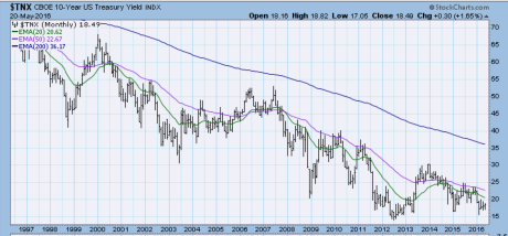
I’ve placed my bets on lower interest rates for the past 13 years, and, I’ve only been proven wrong for very, very short periods of time.
Precious Metals
The demand for Gold surged +21% in Q’1 of 2016, – the fastest pace on record, according to a May 12th-World Gold Council <WGC> report. WGC officials attributed the rise to 4 principal factors: 1- negative interest rates in Japan and Europe; 2- the chance of a devaluation of China’s Yuan; 3- the likelihood of a slower trajectory of Fed rate hikes – than suggested by the Fed’s “Dots Plot,” and 4- expectations of a weaker US$.
A quote from legendary trader and investor W. D. Gann sets the stage for the current state of the gold/silver/platinum/palladium markets.
“Anytime a market exceeds the largest percentage decline or the largest time period of the corrections on the way down in a bear market, it is showing that the momentum is shifting and that buying pressure is finally overcoming selling pressure.”
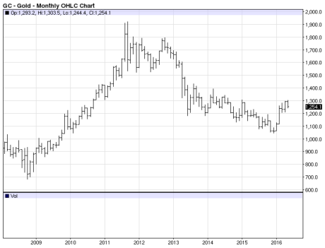
Marshaling the evidence, in the gold there has never been a bear market rally which has exceeded the preceding bear market rally highs on the way down. Our advance has exceeded the previous two.
Only the 48% bear market rally in 1980 in the aftermath of the greatest bull market in history and the 27% advance in 2008 in the midst of the financial crisis have been greater in percentage terms than our 25% advance. Our DNA doesn’t match these two at all. The only conclusion we can draw is that we have a 1st leg up in a new bull market and not a bear market rally.
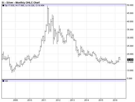
Silver hit record demand in 2015, but had its third successive annual deficit, which was 60% larger than 2014. These were just a few of the findings of this year’s report. However, the report is backward looking and the silver market is much different today than it was towards the end of last year. Erica Rannestad, precious metals demand senior analyst for Thomson Reuters GFMS, agreed in that interest for silver has shifted, which is helping to support prices this year. “First off, in the past 2-3 years, you’ve seen bargain buying. This year, you’ve seen a lot more safe-haven buying, which has been pushing prices higher,” she explained.
Oil
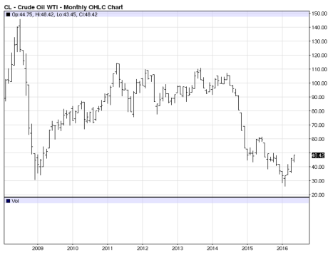
There are a lot of tankers sitting off the coast of Singapore waiting for a price increase and refinery availability to dump their cargo (http://www.zerohedge.com/news/2016-05-20/something-stunning-taking-place-coast-singapore ). South American suppliers are trying to sell every drop to have available funds to ensure the population is fed, staving off utter collapse and revolution. India is even trading drugs for oil now. Middle Eastern suppliers are holding supply steady in an attempt to make enough money to support their lifestyles and basic requirements. International refineries are working as fast as they can to turn over supply in hopes of being able to pay their bills. All of this will have a short term cap on prices.
Longer term, as players go bankrupt and governments are overthrown, then supply will be limited into a market of relatively stable world demand. This will drive prices higher, but it is a couple of years away, at least.
In the short term, expect that every approach of WTI Crude Oil near the 50 level will be sold off.
03162015 March 16, 2015
Posted by easterntiger in economic history, economy, financial, gold, markets, oil, silver, stocks.Tags: bonds, Economic Cycles, Economic History, f fund, Federal Open Market Operations, Finance, Financial Trends, gold, interest rates, oil, QE, silver, stock market, stocks
add a comment
Current Positions (Slight Changes)
I(Intl) – exit; S(Small Cap) – exit; C(S&P) –exit
F(bonds) – up to 50%; G (money market) – remainder
Weekly Momentum Indicator (WMI) last 4 weeks, thru 03/13/15
(S&P100 compared to exactly 3 weeks before***)
-26.06, -13.71, +20.39, +49
(Today from 3 Fridays ago/2 Fri’s fm 4 Friday’s ago/3 Fri’s fm 5 Friday’s ago/4 Fri’s fm 6 Friday’s ago)
Another better-than-expected jobs report came out last week. This time, the stock market reacted negatively. The reasoning behind the drop is that this continued string of above-expectations jobs reports (this is currently the best sustained jobs trend in 15 years) is quickly raising the odds that the Fed will begin hiking rates at the June FOMC meeting.
Therefore, investors appear to be going through with withdrawal pains ahead of the FOMC announcement next Wednesday. This is premature and unwarranted since there is very little chance the Fed is going to make a material change before June and probably September. The Fed can’t withdraw stimulus by raising rates with the dollar surging nearly 1% per day. That would send the dollar into hyper drive and S&P earnings into the cellar.
Market Statistics

Margin Debt
 (click chart to expand in separate window)
Repeated/updated from the four previous reports, an accurate count of margin debt, or, levels of borrowed money at all brokerage firms for each month is carefully watched by the financial media. It’s this combination of a) margin debt, b) Fed money loaned to investment banks (finished), and c) stock buybacks by corporations (no significant increases over last year) that have provided a vast majority of the power to the markets for much of the past 6 years. The result of margin debt figure through January is shown in the chart above, for comparison to all months of the past 4 years. (The last two dots have been recorded since the last report)
Not so coincident with the weakening trend in margin debt, the S&P celebrated its six-year anniversary of a ‘bull’ market this month. It is up over 200% during that period. Remember that this increase is measured from a 2009 level that had wiped out 12 years of gains. This 200%, repeated quite frequently in the media, represents much of the same level gained from 1997 to the previous high in 2007, with a loss of over 50% from 2007 to 2009. And, unfortunately this is the third strongest six-year gain since 1907. The other two times were in 1929 and 1999 and neither ended well. Both resulted in major market crashes. The biggest difference between this increase and the first two is that only this one required trillions in ‘float’ from the Federal Reserve balance sheet that still has to be repaid, at some point stretching into the next decade.
(click chart to expand in separate window)

The current rally of 154.08% is also the 6th longest in history and very close to becoming the 5th if it surpasses the rally from 1982 through the 1987 crash of 156.62%.
This data alone doesn’t mean much in isolation. It would be relatively easy to argue, according to the charts above, that the markets could go significantly higher from current levels. However, price data must be aligned to valuations.
At 27.85x current earning the markets are currently at valuation levels where previous bull markets have ended rather than continued. Furthermore, the markets have exceeded the pre-financial crisis peak of 27.65x earnings. If earnings continue to deteriorate, market valuations could rise rapidly even if prices remain stagnant.
While stock prices can certainly be driven much higher through global Central Bank’s ongoing interventions, the inability for the economic variables to “replay the tape” of the 80’s and 90’s is not likely. This dramatically increases the potential of a rather nasty mean reversion at some point in the future. It is precisely that reversion that will likely create the “set up” necessary to start the next great secular bull market.
Funds
(click chart to expand in separate window)

Fund positioning in the past two months has been difficult, at best. Notice from the combined charts above of our primary funds, a miniscule loss on the F, to tiny gains on the C and S, to a more measurable gain on the riskiest fund at the moment, the I fund, a gain that is only attributable to the start of a quantitative easing program (QE), the same as which we have just finished last October. Remember that the I fund and S funds were the weakest performers in the past 12-15 months. While there might be a presumption of gains or strength in the I fund, based upon this QE program initiation, the actual risk can be seen with the anticipation for the first few weeks, now followed by a corrective phase now underway that coincides with weakening in a broader cross-section of world financial markets, including ours. The jury is still out on whether or not the QE will have a similar effect on European markets, due to their lack of singularity, as opposed to our more unified and somewhat redundant markets, where QE worked, for a while, and, diminished in impact over time.
It was a volatile week in the markets but the damage was muted. Short-term, last week’s price action was bearish. The cash S&P 500 both broke a prior week’s low and closed below the rising 20-day Moving Average for the first time in a month. This altered the bullish price structure. In addition, the market also closed well below the late December high of 2093.55 (WD Gann rule: Old price resistance, once it has been broken, becomes new price support). Despite two days out of the last six with -300 point Dow declines the Dow only gave up -197 for the week or -0.6%. That was the best performance of any large cap index. The Russell 2000 actually gained +1.2% for the week and that is the bright spot this weekend. Obviously the large cap indexes are suffering from dollar pressures where the impact of the dollar on the small caps is minimal.
For instance Hewlett Packard said they could lose $1.5 billion in 2015 because of the dollar and it has only strengthened since that warning. They could be up to a $2 billion loss before the quarter is over. Most small caps don’t even generate $2 billion in annual revenue. The difference in scale is the key. The earnings capacity of the small caps is not being harmed while the big caps are losing billions.
For instance, IBM gets 55% of its revenue overseas. Pfizer 66%, Wynn Resorts 72%, Applied Materials 78% and Phillip-Morris 99%. Even with active hedging programs a 26% increase in the dollar over the last 9 months is a dramatic difference. Companies earning money in euros, yuan or yen have seen their purchasing power drop considerably when products have to be purchased in dollars. In the case of companies like Hewlett Packard they can sell their products in foreign currencies after marking them up but then they have to convert those currencies back to dollars to bring the money home.
In theory we could just ignore the large cap stocks and concentrate only on small caps. Unfortunately the large caps control the major indexes and that is what represents the market. If someone asks you at dinner what the market did today you more than likely would not say the Russell 2000 gained 4 points. They would look at you like you said aliens visited the NYSE today. The market is represented to the public by the changes in the Dow, S&P and Nasdaq.
The S&P gave back -18 points for the week or -.86%. Given the big intra-day swings I feel fortunate it was only -18 points. The index bounced off the 100-day average at 2044 for the last four days without a breakdown. So far that support is holding and the 150-day at 2019 is untested. If you only look at the chart of the S&P it would appear that test of 2019 could come this week. However, if you look at the rebound in the Russell it suggests the S&P could rally into the FOMC meeting on expectations for no change in the post meeting statement.
When the S&P rallied on Thursday it came to a dead stop at 2065 which was resistance in January. With the three-day dip to 2040 and solid stop at 2065 that gives us our breakout targets for next week. A move outside either of those levels should give us market direction. I would not be surprised to see the 150-day average at 2019 to be tested.
Support 2019, 2040, resistance 2065, 2080.

At the low on Friday the Dow was down -265 points at 11:30. That makes the -145 at the close appear relatively tame. The Dow inexplicably rebounded off the 100-day average at 17,655 for the last three days. The Dow rarely honors any moving average but apparently somebody was watching last week and decided that was a decent place to put buy orders. Since very few people actually buy a Dow ETF that means somebody was buying Dow stocks. If we delve into this a little closer the answer appears. It was the three financial stocks, GS, AXP and JPM, that held up the Dow and kept it from falling under the 100-day. It was not that they powered the index higher but they did react positively to the banking stress test capital expenditure news and that kept the Dow from declining. United Health, Du Pont, Disney, Travelers and Verizon also contributed. They offset the obvious losers of Exxon, Chevron, GE, Visa and IBM.
When the Dow rebounded on Thursday’s short squeeze it came to an abrupt halt at 17,900 and resistance from January. This gives us our trading range for next week from 17,640 to 17,900. A move outside that range gives us market direction.

The Nasdaq lost -55 points or -1.1%. A funny thing happened on the Nasdaq. The decline came to a dead stop at old uptrend resistance at 4850. The index held up remarkably well and I think it could follow the Russell 2000 higher if the small caps continue their rebound next week. The Nasdaq chart is still in much better shape than the Dow and S&P and could be poised to return to the highs if the Fed makes no changes.
Apple quit going down and that was a major factor in the Nasdaq minimizing its losses. The other big caps were still bleeding points as you can see in the table below but Apple is the 800 pound gorilla and the post Apple Watch “sell the news” event knocked off $5 early in the week but remained flat the last three days.
Resistance 4900, 5000. Support 4850, 4730.

The Russell 2000 rebounded to close within 6 points of a new high on Thursday. Friday’s early decline was almost erased with only a -4 point loss to end -10 points from a new high. This is very bullish given the Dow and S&P losses on Friday. Per my comments above the lack of dollar impact on the small caps could make them the favorite of the investing class over the coming weeks. That does not mean they will soar while the rest of the indexes collapse but all things being equal if the big cap indexes are at least neutral the Russell could break out again. That could trigger buying in the bigger indexes.
Watch the Russell 200 closely next week. If the Fed does nothing the Russell could be the leading index. However, they would be hurt significantly by a change in Fed policy because they have a lot of debt and higher rates will hurt. Obviously nothing will change in the near future but a change in Fed policy will make investors more cautious well ahead of any rate hike.
Resistance 1242, support 1220, 1205.

Bonds/Interest Rates
Declining oil prices will likely continue to lower the consumer price index as well. Also known as the CPI, the inflation metric for the last two figures released on February 15th and March 13th showed a rate that is still falling under expectations. Inflation targets have been hard for the Federal Reserve to maintain and the drop in oil prices isn’t helping matters.
If inflation metrics can’t maintain high enough levels, that may force the Fed to refrain from raising interest rates later this year.
Morgan Stanley economist, Ellen Zentner, said the Fed will not raise rates until March 2016. She pointed out that for every 1% gain in the dollar it is the equivalent of a 14 basis point hike in rates because of the negative impact on the U.S. economy. The dollar is up +26.6% since May. That is the equivalent of a 3.72% hike in interest rates. While the Fed wants to raise rates the rapidly falling inflation and potential deflation risks simply point to the “data dependent” Fed being forced to wait on the sidelines. Zentner said even if the Fed does remove the word patient from the statement they are still not going to raise rates in 2015. They may remove the word just to create some volatility in the bond market and that will force real rates slightly higher without the Fed actually making a move. If they remove the word the equity market could have a tightening tantrum and the Fed has to consider that as well.
The building angst over the soaring dollar is finally translating into the equity market. With 45% of the S&P getting 50% of their earnings from overseas the dollar strength is going to be a major drag on Q1/Q2 earnings. Investors ignored this for the last several months but the daily decline in earnings estimates and the daily rise in the dollar has finally hit critical mass.
Dollar
In the ‘Art of War’, Sun Tzu said that ‘..the threat of an attack is almost as effective as the attack itself..’ The prospect of an interest rate hike in the US while the rest of the world is still easing catapulted the US cash US dollar index to a new eleven and a half year high.
At today’s high of 100.06, the 10 month and 4 day duration of the move from the 2014 low is the second-longest leg up since 1971. To match the record 11 month and 18 day run into the February 25, 1985 high, the greenback would have to post new highs on April 26.
On the monthly time-frame, the cash US dollar index has posted gains for eight-consecutive months. This is a record monthly winning streak.
Furthermore, the 27% rally from the May 8, 2014 low ties for second place as the largest leg up in history. It was bested only by the 30% advance off the March 1984 low.
The rising dollar continues to pressure oil and other commodities. The dollar index closed at 100.18 on Friday. That represents a 26.6% gain since May. This is almost unprecedented.


The idiot light on investor dashboards is blinking red and warning of an impending crisis.
Market volatility has returned with back to back days of alternating three digit moves on the Dow and the 100-day average on the S&P acting like last ditch support. With 2.5 days left before the FOMC statement there was very little short covering ahead of the weekend.
Oil prices collapsed under the pressure of the dollar, rising inventories and a new U.S. production record. Falling oil prices helped drag equities lower and the $40 level for Crude could be hit next week.
Economic news did not help. The Producer Price Index (PPI) fell -0.5% for February after a -0.8% drop in the prior month. This is the fourth consecutive monthly decline. Expectations were for a +0.5% increase. For once it was not energy prices dragging down the index. Energy prices were unchanged thanks to that rebound in oil prices in February. It was a -1.6% decline in food prices that pushed the index lower. This comes after a -1.1% decline in January. How did this happen? Food prices almost never decline. You can thank the rising dollar pushing the prices of all commodities lower and slowing exports.
Core PPI, excluding food and energy, fell -0.5%. The headline PPI is now -0.7% lower than year ago levels and when compared to the +1.0% YoY in December it shows how fast prices are falling.
Not only is inflation nonexistent the risks of deflation have increased in recent months. There is almost zero chance the Fed is going to hike rates in the near future given the strong dollar and deflation risks.
Oil

Oil prices declined to $44.75 intraday and closing in on the January low of $43.58. Inventories rose 4.5 million barrels to another 8- year high at 448.9 million. Cushing storage rose to 51.5 million and just under the record of 51.9 million barrels. Active rigs declined another -67 to 1,125 and -806 below the September high of 1,931. Oil rigs declined -56 to 866 and -46% below the 1,609 high on October 10th. Baker Hughes is targeting a 50% decline as normal in a bear market so another -60 rigs if they are right. At the pace they are dropping I expect to be well below 800 active oil rigs. Active gas rigs declined another -11 to 257 and a new 18 year low.
Offshore rigs declined -3 to 48 and a multi-month low.
The conversation level over shrinking storage is reaching a crescendo. However, numerous energy analysts have come out over the last week saying there is 25-35% storage still available. The additional capacity is in the Houston area and in some tanks around the U.S. shale fields. That is like a driver looking for a 5 gallon gas can in Denver and having the service station attendant saying, “On the computer we have a dozen in Dallas.” If the storage is not where you need it then you still have a problem. With the futures delivery point at Cushing Oklahoma rapidly filling up the pipelines into Cushing will have to be turned off if/when capacity is reached. That means wells will have to shut down if the oil in the pipelines is not moving.
We could be 3-4 weeks away from a critical point for crude pricing. Refineries will come out of their maintenance cycle in early April and begin to produce summer blend gasoline ahead of the Memorial Day weekend that kicks off the summer driving season. Until then we should continue to see inventories build. However, imports did decline about 600,000 bpd last week to 6.79 mbpd. Refiners may also be feeling the storage crunch and will have to cut back on imports in the weeks ahead.
Analysts are expecting the January low of $43.58 to be tested and most believe we will see $40 before March is over. If Cushing does halt or curtail the inflow of oil we could see the prices decline in a hurry.
Precious Metals
Also due to pressure from the rising dollar, gold and silver prices are also being slammed. Gold declined to $1,150 and a 3-month low. Silver has fallen back to January 2010 levels at $15.50 and the 2011 spike to $50 has been completely erased. The drop in silver has been due to the dollar but in silver’s case it also represents a decline in the global economy. Like copper, silver is used in electronics manufacturing and demand has declined as fewer large devices are sold and more phones and tablets with less silver and copper. About 25% of the silver mined today is non-economic. That means they are losing money on every ounce they sell but they have to keep the mines running at a minimum level to maintain operational capability.

Silver stockpiles are shrinking as the current mine production is less than demand. Eventually prices will rise in spite of the soaring dollar but until the global economy recovers I expect copper and silver to remain weak.


Forecasts
The Bloomberg ECO Surprise Index measures the number of economic data beats and misses in the USA economic forecasts. The index has fallen to its lowest level since 2009 when we were in the middle of the Great Recession. Forecasts have been missed by the largest majority in the last six years. The only major report to beat has been the payrolls. Everything else has been routinely missing the estimates and the market has been ignoring it. Citigroup has their own chart of economic misses by country. The U.S. is at the bottom of the list on that index as well. Both charts from Bloomberg.
(click charts to expand in separate window)


The Atlanta Fed’s real time GDPNow forecast fell from +1.2% growth for Q1 to only +0.6% growth after the retail sales report on March 12th. How could the FOMC raise rates in these conditions?
 We are less than 2 months away from the 3rd longest streak of gains without a 10% correction. The last correction was in 2011. If the S&P did crater again next week all the way down to 2,000 that would still be only a garden variety -5% dip like we have seen many times before in this bull market. It is not the end of the world. The S&P could easily retest that 2,000 level soon.

The rebound by the Russell might give some hope for next week but the market will remain headline driven ahead of the FOMC announcement on Wednesday. What happens after that event is entirely up to the Fed.
I expected a market decline after option expiration and the last two weeks may have been just a testing phase ahead of that event. With earnings declining, GDP revisions sinking, China weakening, oil prices potentially testing $40, retail sales and consumer confidence falling and Greece threatening to exit the EU again, it would not take much of a push by the Fed to crash the market. Hopefully they understand the box they are in.
Greece
The Greek government announced it was going to use cash belonging to pension funds and other public entities for its own use. The amendment submitted in parliament said “Cash reserves of pension funds and other public entities kept in the Bank of Greece deposit accounts can be fully invested in Greek sovereign notes. Pension funds and public entities will be able to claim damages from Greek state in case of overdue repayment or partial repayment. The finance minister said pension funds are not required to transfer their reserves to the Bank of Greece. At least not yet.
The Greek Finance Minister Yanis Varoufakis said last week, “Greece is the most bankrupt country in the world and European leaders knew all along that Athens would never repay its debts.” Greek Prime Minister Tsipras said, “Greece can’t pretend its debt burden is sustainable.” Apparently the house of cards is about to crumble.
Very Important
The Debt Ceiling debate returns next week. The temporary reprieve on the $18 trillion debt ceiling expires and congress will have to deal with it in some form. Whenever this has happened in the recent past there has been numerous headlines and market volatility. With a new crop of republicans in office there is bound to be some grandstanding even if it is just temporary. President Obama is not likely to compromise since it is in his favor to have the republicans self destruct over the debt fight. There is not likely to be a Obama-GOP compromise and that means there will be some ugly headlines before the GOP caves in and extends the ceiling. This is just one more reason why other nations want to be freed from using the dollar for their trading. The uncertainty is a headache for them because they really don’t understand American politics.
This is a quadruple witching option expiration week. This happens four times a year and historically these produce bullish weeks for the Dow and S&P about 2 out of 3 times. Since 1983 the Nasdaq has posted 19 advances and 13 declines in the March week. However, the week after quadruple witching, especially in March, is typically negative.
Random Thoughts
On March 16th, 2004 the post Fed statement had the following sentences.
(Hat tip to Art Cashin)
The Committee perceives the upside and downside risks to the attainment of sustainable growth for the next few quarters to be roughly equal. The probability of an unwelcome fall in inflation has diminished in recent months and now appears almost equal to that of a rise in inflation. With inflation quite low and resource use slack, the Committee believes that it can be patient in removing its policy accommodation.
In the May 4th, 2004 statement the Fed said:
The FOMC decided today to keep its target for the federal funds rate at 1%.
The Committee perceives the upside and downside risks to the attainment of sustainable growth for the next few quarters are roughly equal. Similarly, the risks to the goal of price stability have moved into balance. At this juncture, with inflation low and resource use slack, the Committee believes that policy accommodation can be removed at a pace that is likely to be measured.
In the June 30th, 2004 statement the fed said:
The FOMC decided today to raise its target for the federal funds rate by 25 basis points to 1.25%.
Apparently the Fed reuses its prior language a lot and conditions could be shaping up for a repeat of that 2004 scenario. However, economic conditions are significantly worse than in 2004 and that should keep these statements from being repeated.
01122015 January 12, 2015
Posted by easterntiger in economic history, economy, financial, gold, markets, oil, silver, stocks.Tags: bonds, Economic Cycles, economic theory, Economics, Federal Open Market Operations, Financial Trends, interest rates, momentum indicator, oil, QE, S&P 500, stock market index
add a comment
Current Positions (Slight Changes)
I(Intl) – exit; S(Small Cap) – exit; C(S&P) –exit
F(bonds) – up to 50%; G (money market) – remainder
Weekly Momentum Indicator (WMI) last 4 weeks, thru 01/08/15
(S&P100 compared to exactly 3 weeks before***)
-9.74, +22, +2.88,–1.26 (Today from 3 Fridays ago/2 Fri’s fm 4 Friday’s ago/3 Fri’s fm 5 Friday’s ago/4 Fri’s fm 6 Friday’s ago)
The seemingly-invincible US stock markets powered higher again last year, still directly fueled by the Fed’s epic quantitative-easing money creation. But 2015 is shaping up to be radically different from the past couple years. The Fed effectively abandoned the stock markets when it terminated its bond buying late last year.
So this year we will finally see if these lofty stock markets can remain afloat without the Fed. But, let’s not ignore the fact that the $4 trillion added to the market over the past 5/6 years are still on the Fed balance sheet and are still providing artificial buoyancy that was NOT intended to end up in your pockets. It’s called the ‘wealth effect’, not ‘wealth’.
Mainstream stock investors and speculators are certainly loving life these days. The flagship S&P 500 stock index enjoyed an excellent 2014, climbing 11.4%. And that followed 2013’s massive and amazing 29.6% blast higher! The last couple years were truly extraordinary and record-breaking on many fronts, with the US stock markets essentially doing nothing but rally to an endless streak of new nominal (not inflation adjusted) ‘record’ highs. But, the Fed’s wildly-unprecedented balance-sheet growth of recent years is over. 2015 will actually be the first year since 2007 without any quantitative easing!
Funds End of Year Results
Here are the relative positions of the respective funds for last year.
************Equity Funds********** ******Bond Fund*******
S Fund I Fund C Fund F Fund
+7.80% -5.27% +13.78% +6.73%
+/- F fund +/- F fund +/- F fund
+1.13% -12.0% +7.05%
What these end of year results never reflect are the degree of risk involved in generating these returns. For example, an end of year return on the S fund of 7.8% ignores the -4.9% YTD returns that occurred in the S in February and, even the -4.05% YTD returns as of late October. The C fund had only yielded a 2.46% return YTD in early October. The F fund yielded no negative returns all year, and, ironically, had yielded approximately half of the final return for the year exactly 6 months into the year. In a bear market, even a bear market pretending to be a bull market, it’s ‘stairs up/elevator down’. Knowing your risk is just as much a part of the game as knowing your reward. Only one of three equity funds measurably beat our bond fund for the year.
Here are the total 1 mo, 1 yr, 3 yr and 5 yr returns for a range of investments in world financial markets, including bond, commodity, precious metals markets as of 12/31/14.
 Selected Market Stats for recent weeks, plus December, 2014 and 2013
So, what’s next?
(The following is repeated from a previous post – only this time, the party takes place in Europe) Imagine that it’s 4AM after a huge party. Many have gradually left (a) . All lights are still on. There are a couple of large groups still left, talking loudly and sipping on their final drinks. The bar is closed. The crowds are so busy drinking and talking that they don’t notice that the band has played it’s last tune and has started packing up, all except the drummer, tapping a simple beat. The room is being charged by the hour, so, there won’t be an announcer to tell anyone that it’s time to clear out; the meter is running. Every 15 minutes, some guy named ‘Fed’(US), or, Mario Draghi (Europe) walks across the stage and tells everyone to hang around while he looks for another band. (It’s not coming.) The groups cheer each time. Outside, there are storms moving in. Most attendees have anticipated the storm by leaving early (b). Those still there will either take their risks, driving through the storm (c), or, stay around to ‘ride it out’ (d). In which group are you? a, b, c or d?
In the US as well as in Europe, stocks skyrocketed on Thursday, as investors got excited about the letter. In a January 6 letter to European Parliament member, Luke Ming Flanagan, European Central Bank (ECB) President Mario Draghi offered another one of his trademark teasers about the possibility of an ECB-implemented, quantitative easing program. In this case, the magic word was could: Should it become necessary to further address risks of too prolonged a period of low inflation, the Governing Council is unanimous in its commitment to using additional unconventional instruments within its mandate. This may imply adjusting the size, pace and composition of the ECB’s measures. Such measures may entail the purchase of a variety of assets (?) one of which could be sovereign bonds, as mentioned in your letter.
This tactic never fails to work. Whenever the European stock market slumps, all Mr. Draghi, or our Fed members, have to do is say that the ECB/the Fed might, or could, or may, or should implement a quantitative easing program – and stock prices skyrocket. Nevertheless, in the real world, it is highly unlikely that the ECB would ever conduct a quantitative easing program because there are no Eurobonds for it to purchase. Further, this week the European Court of Justice is scheduled to rule on the legality of quantitative easing on Wednesday, January 14th, which could throw a wrench into the ECB plans.
The president of the ECB and the chief of the Federal Reserve are both reading from the same, flawed playbook. When the financial markets appear ready to swoon, they just walk across the stage and tell everyone that they’re ‘looking for another band’; so, investors, please leave your money in the market and wait, until you stop believing that the band is coming, or, until you start to suffer losses that you cannot endure.
But, if markets are such great value, why would Warren Buffett now be sitting on a record amount of cash?
At the end of 2007, his firm, Berkshire Hathaway (NYSE: BRK-A), was sitting on $44 billion in cash. Berkshire’s cash balance was down to a more reasonable $25 billion by the end of 2008 after acquiring partial stakes in several blue chips firms such as General Electric and Goldman Sachs. As Bloomberg News noted in October 2013 , Buffett “likes to keep $20 billion on hand should the reinsurance operations need to pay large claims.” If Buffett thought he was sitting on too much cash seven years ago, before his GE and Goldman Sachs purchases, his troubles have grown larger now. At the end of Q2 2014, Berkshire Hathaway held $55 billion in cash and investments — a company record. If Warren Buffett is not fully invested and holding cash, why should you be fully invested? Could it be that Warren Buffett knows something, among other things, that this chart I’ve kept up all year is telling him? 
Repeated/updated from the three previous reports, an accurate count of margin debt, or, levels of borrowed money at all brokerage firms for each month is carefully watched by the financial media. It’s this combination of a) margin debt, b) Fed money loaned to investment banks (finished), and c) stock buybacks by corporations (slight decline over last year) that have provided a vast majority of the power to the markets for much of the past 5/6 years. The result of margin debt figure through November is shown in the chart above, for comparison to all months of the past 3.5 years. (I’ll have the December figure in 2 weeks.)
Where do the experts think the market is headed this year?
Here are the current forecasts by major bank analysts for end-of-year S&P 500 levels.
(the S&P 500 closed at 2058.9 on 12/31/14, and is already slightly negative for the year)
-10.75% – 1850 – David Bianco, Deutsche Bank: S&P: EPS: $119.00
-7.72% – 1900 – Brian Belski, BMO: S&P: EPS: $116.00
-7.72% – 1900 – Barry Knapp, Barclays: S&P: EPS: $119.00
-7.72% – 1900 – David Kostin, Goldman Sachs: S&P: EPS: $116.00
-6.5% – 1925 – Michael Kurtz, Nomura: S&P: EPS: $112.50
-5.29% – 1950 – Sean Darby, Jefferies: S&P: EPS: $121.00
-5.29% – 1950 – Jonathan Golub, RBC: S&P: EPS: $119.00
-5.29% – 1950 – Julian Emanuel, UBS: S&P: EPS: $116.00
-4.8% – 1960 – Andrew Garthwaite, Credit Suisse: S&P: EPS: $115.90
-4.07% – 1975 – Tobias Levkovich, Citigroup: S&P: EPS: $117.50
-2.86% – 2000 – Savita Subramanian, Bank of America: S&P: EPS: $118.00
-2.18% – 2014 – Adam Parker, Morgan Stanley: S&P: EPS: $116.00
-2.18% – 2014 – John Stoltzfus, Oppenheimer: S&P: EPS: $115.00
+0.78% – 2014 – Tom Lee, JP Morgan: S&P: EPS: $120.00
The average expected return from these major investment banks for 2015 is -5.11%.
And, keep in mind this is measured on what was the strongest of several markets covering US stocks. Other US exchanges did not perform nearly as well in 2014 as the S&P 500 (refer to ‘Selected Market Stats’ above.)
With all due respect to these recent returns, such anomalously-one-sided stock markets naturally bred the extreme euphoria universally evident today. Greedy traders have totally forgotten the endlessly-cyclical nature of stock-market history, where bear markets always follow bulls. They’ve convinced themselves that these stock markets can keep on magically levitating indefinitely, that major sell-offs of any magnitude are no longer a threat worth considering. But extrapolating that incredible upside action of 2013 and 2014 into the future is supremely irrational, because its drivers have vanished. The past couple years’ mammoth stock-market rally was completely artificial, the product of central-bank market manipulation. The Federal Reserve not only created vast sums of new money out of thin air to monetize bonds, but it aggressively jawboned the stock markets higher.
Virtually every time the Fed made a decision, or its high officials opened their mouths, the implication was being made that it wouldn’t tolerate any material stock-market sell-off. The Fed kept saying that it was ready to ramp up quantitative easing if necessary. Stock traders understood this exactly the way the Fed intended, assuming the American central bank was effectively backstopping the US stock markets! But, the bottom line is the Fed has abandoned the stock markets. The powerful rallies of 2013 and 2014 were driven by extreme Fed money printing to buy up bonds.
But with QE3’s new buying terminated and any QE4 a political impossibility with the new Republican Congress, 2015 is going to look vastly different. A shrinking Fed balance sheet sparked major corrections even from far lower and cheaper stock levels.
The domestic stock market cannot deliver a sustainable double-digit return without entering a speculative bubble, based on historical data reflecting correlations between the level of the Shiller P/E and subsequent outcomes in the stock market over the past 134 years. Conditions are ripe for a speculative bubble in the domestic stock market in 2015, and investors should reduce risk in their portfolios in stages during the coming year. Investors should expect below-average returns from the domestic stock market over the next five to 10 years. Indeed, to expect anything more than mid-single digits requires an assumption that stocks will enter a speculative bubble. The reason is excessive valuation.
From today’s valuation level the only way to sustain significant upside is to assume a future valuation multiple that would put the stock market into bubble territory. The S&P 500 Index was recently trading at a cyclically adjusted price-to-earnings (p/e) ratio, or “CAPE” of 27.3, meaning the stock market is priced at more than 27 times the 10-year average earnings of the underlying companies in the index. This is highly unusual. Out of 1,608 monthly observations between January 1881 and December 2014, the CAPE for the U.S. stock market has measured 27 or higher just 88 times. That is a frequency of only 5.5% throughout this 134-year period.  Blending several forecasts together we get a 0.89% annual return forecast for the stock market over the coming decade. A straight comparison to 10-year treasuries at 2.2% shows them to be the more attractive of the two asset classes right now. Even 5-year treasuries are paying 1.6%, nearly double our model’s forecast.* All in all, this looks to be the second worst time to own equities in history.
Still, the stock market’s uptrend remains intact as all of the major indexes currently trade above their 200-day moving averages. But as I’ve noted recently, there are plenty of signs that the trend is not as healthy as bulls would hope. The advance/decline line, new highs-new lows and the percentage of stocks trading above their 200-day moving averages are all diverging fairly dramatically from the new highs recently set in the indexes. This is a serious red flag.
And now that our market cap-to-GDP and household equities indicators have possibly peaked, along with high-yield spreads (inverted), margin debt (shown on my chart above) and corporate profit margins, there seems to be a very good possibility that the uptrend could be tested in short order. In fact, when I go back and look at the times when all of these indicators peaked around the same time over the past 15 years or so, they coincide pretty neatly with the major stock market peaks: 
 So the uptrend may still be intact but I think we have a plethora (yes, a plethora) of evidence that suggests its days may be numbered. Foreign equities have mostly given up their uptrends over the past few months, demonstrated in the negative return of our I fund, and commodities, led by the oil crash, look even uglier. Precious metals, a refuge, have held up surprisingly on a rising channel going back 10-15 years. How much longer can the US stock market swim against the tide?
Bonds
My exit from the F fund in early October was timely, since the price level fell immediately afterward, by about 1%, and only barely exceeded above that exit point by year-end. The weakness in equities after the fake ‘Santa rally’ showed a corresponding strength in bonds, and, another increase in F fund prices. Current levels are about ¾% higher than that October exit. This trend is expected to continue with the failure of additional strength in equities. More importantly, any significant breakdown in equities would translate into an immediate transfer from stocks to bonds, and further strengthening in the F fund.

Oil
The reason oil prices started sliding in June can be explained by record growth in US production, sputtering demand from Europe and China, and an unwind of the Middle East geopolitical risk premium.
The world oil market, which consumes 92 million barrels a day, currently has one million barrels more than it needs. The US pumped 8.97 million barrels a day by the end of October (the highest since 1985) thanks partly to increases in shale-oil output which accounts for 5 million barrels a day. Libya’s production has recovered from 200,000 barrels a day in April to 900,000 barrels a day, while war hasn’t stopped production in Iraq and output there has risen to an all-time high level of 3.3 million barrels per day. The IMF, meanwhile, has cut its projection for global growth in 2014 for the third time this year to 3.3%. This year, it still expects growth to pick up again, but only slightly.
Everyone believes that the oil-price decline is temporary. It is assumed that once oil prices plummet, the process is much more likely to be self-stabilizing than destabilizing. As the theory goes, once demand drops, price follows, and leveraged high-cost producers shut production. Eventually, supply falls to match demand and price stabilizes. When demand recovers, so does price, and marginal production returns to meet rising demand. Prices then stabilize at a higher level as supply and demand become more balanced. It has been well-said that: “In theory, there is no difference between theory and practice.
But, in practice, there is.” For the classic model to hold true in oil’s case, the market must correctly anticipate the equalizing role of price in the presence of supply/demand imbalances. By 2020, we see oil demand realistically rising to no more than 95 million barrels a day. North American oil consumption has been in a structural decline, whereas the European economy is expected to remain lackluster. Risks to the Chinese economy are tilted to the downside and we find no reason to anticipate a positive growth surprise. This limits the potential for growth in oil demand and leads us to believe global oil prices will struggle to rebound to their previous levels.
The International Energy Agency says we could soon hit “peak oil demand”, due to cheaper fuel alternatives, environmental concerns, and improving oil efficiency. The oil market will remain well supplied, even at lower prices. We believe incremental oil demand through 2020 can be met with rising output in Libya, Iraq and Iran. We expect production in Libya to return to the level prior to the civil war, adding at least 600,000 barrels a day to world supply. Big investments in Iraq’s oil industry should pay off too with production rising an extra 1.5-2 million barrels a day over the next five years. We also believe the American-Iranian détente is serious, and that sooner or later both parties will agree to terms and reach a definitive agreement. This will eventually lead to more oil supply coming to the market from Iran, further depressing prices in the “new oil normal”. Iranian oil production has fallen from 4 million barrels a day in 2008 to 2.8 million today, which we would expect to fully recover once international relations normalize. In sum, we see the potential for supply to increase by nearly 4 million barrels a day at the lowest marginal cost, which should be enough to offset output cuts from marginal players in a sluggish world economy.  Some analysis leads us to conclude that the price of oil is unlikely to average $100 again for the remaining decade.
Normally, falling oil prices would be expected to boost global growth. Ed Morse of Citigroup estimates lower oil prices provide a stimulus of as much as $1.1 trillion to global economies by lowering the cost of fuels and other commodities. And, unfortunately, another downside to falling prices are related to high levels of junk-bond financing to increase the drilling infrastructure. Therefore, due to falling prices and the resulting closing of drilling rigs with higher operating costs, many of these bonds will fail, putting pressure on other related assets that are dependent on them. This could very well provide the catalyst to a stock sell-off, without warning.
Per-capita oil consumption in the US is among the highest in the world so the fall in energy prices raises purchasing power compared to most other major economies. The US consumer stands to benefit from cheaper heating oil and materially lower gasoline prices. It is estimated that the average household consumes 1,200 gallons of gasoline a year, which translates to annual savings of $120 for every 10-cent drop in the price of gasoline.
According to Ethan Harris of Bank of America Merrill Lynch: “Consumers will likely respond quickly to the saving in energy costs. Many families live “hand to mouth”, spending whatever income is available. The Survey of Consumer Finances found that 47% of families had no savings in 2013, up from 44% in the more healthy 2004 economy. Over time, energy costs have become a much bigger part of budgets for low income families. In 2012, families with income below $50,000 spent an average of 21.4% of their income on energy. This is almost double the share in 2001, and it is almost triple the share for families with income above $50,000.” The “new oil normal” will see a wealth transfer from Middle East sovereigns (savers) to leveraged US consumers (spenders).
The consumer windfall from lower oil prices is almost matched by the loss to oil producers. Even though the price of oil has plummeted, the cost of finding it has not. The oil industry has moved into a higher-cost paradigm and continues to spend significantly more money every year without any meaningful growth in total production. Global crude-only output seems to have plateaued in the mid-70 million barrels a day range. The production capacity of 75% of the world’s oilfields is declining by around 6% per year, so the industry requires up to 4 million barrels per day of new capacity just to hold production steady. This has proven to be very difficult.
Analysts at consulting firm EY estimate that out of the 163 upstream mega-projects currently being bankrolled (worth a combined $1.1 trillion), a majority over budget and behind schedule. Large energy companies are sitting on a great deal of cash which cushions the blow from a weak pricing environment in the short-term. It is still important to keep in mind, however, that most big oil projects have been planned around the notion that oil would stay above $100, which no longer seems likely.
The Economist reports that: “The industry is cutting back on some mega-projects, particularly those in the Arctic region, deepwater prospects and others that present technical challenges. Shell recently said it would again delay its Alaska exploration project, thanks to a combination of regulatory hurdles and technological challenges. The $10 billion Rosebank project in Britain’s North Sea, a joint venture between Chevron of the United States and OMV of Austria, is on hold and set to stay that way unless prices recover. And BP says it is “reviewing” its plans for Mad Dog Phase 2, a deepwater exploration project in the Gulf of Mexico. Statoil’s vast Johan Castberg project in the Barents Sea is in limbo as the Norwegian firm and its partners try to rein in spiralling costs; Statoil is expected to cut up to 1,500 jobs this year.
And then there is Kazakhstan’s giant Kashagan project, which thanks to huge cost overruns, lengthy delays and weak oil prices may not be viable for years. Even before the latest fall in oil prices, Shell said its capital spending would be about 20% lower this year than last; Hess will spend about 15% less; and Exxon Mobil and Chevron are making cuts of 5-6%.” Based on analysis by Steven Kopits of Douglas-Westwood: “The vast majority of public oil and gas companies require oil prices of over $100 to achieve positive free cash flow under current capex and dividend programs. Nearly half of the industry needs more than $120. The 4th quartile, where most US E&Ps cluster, needs $130 or more.” As energy companies have gotten used to Brent averaging $110 for the last three years, we believe management teams will be very slow to adjust to the “new oil normal”. They will start by cutting capital spending (the quickest and easiest decision to take), then divesting non-core assets (as access to cheap financing becomes more difficult), and eventually, be forced to take write-downs on assets and projects that are no longer feasible.
The whole adjustment process could take two years or longer, and will accelerate only once CEOs stop thinking the price of oil is going to go back up. A similar phenomenon happened in North America’s natural gas market a couple of years ago. This has vast implications for America’s shale industry. The past five years have seen the budding energy renaissance attract billions of dollars in fixed investment and generate tens of thousands of high-paying jobs. The success of shale has been a major tailwind for the US economy, and its output has been a significant contributor to the improvement in the trade deficit. We believe a sustained drop in the price of oil will slow US shale investment and production growth rates. As much as 50% of shale oil is uneconomic at current prices, and the big unknown factor is the amount of debt that has been incurred by cashflow negative companies to develop resources which will soon become unprofitable at much lower prices.
Robert McNally, a White House adviser to former President George W. Bush and president of the Rapidan Group energy consultancy, told Reuters that Saudi Arabia “will accept a price decline necessary to sweat whatever supply cuts are needed to balance the market out of the US shale oil sector.”
Even legendary oil man T. Boone Pickens believes Saudi Arabia is in a stand-off with US drillers and frackers to “see how the shale boys are going to stand up to a cheaper price.” Prices will have to fall much further though to curb new investment and discourage US production of shale oil. The breakeven point for most shale oil plays has been falling as productivity per well is improving and companies have refined their fracking techniques. The median North American shale development needs an oil price of $57-64 to break even today, compared to $70 last year according to research firm IHS.
| Type | Average Cost Per Barrel |
| OnShore Middle East | $29 |
| OffShore Shelf | $43 |
| Deepwater | $53 |
| OnShore Russia | $54 |
| Onshore Row | $55 |
| North American Shale | $62 |
| Oil Sands | $74 |
While it’s not universally believed that Saudi Arabia engineered the latest swoon in oil prices, it would be foolish not to expect them to take advantage of the new market reality. If we are entering a “new oil normal” where the oil price range may move structurally lower in the coming years, wouldn’t you want to maximise your profits today, when prices are still elevated? If, at the same time, you can drive out fringe production sources from the market, and tip the balance in MENA geopolitics (by hurting Russia and Iran), wouldn’t it be worth it? The Kingdom has a long history of using oil to meet political and economic ends.
10082014 October 9, 2014
Posted by easterntiger in economic history, economy, financial, gold, markets, oil, silver, stocks.Tags: bonds, Economic History, economic theory, economy, gold, interest rates, momentum indicator, oil, QE, S&P 500, silver, stock market, stocks, wilshire 5000 index
add a comment
Current Positions (Slight Changes)
I(Intl) – exit; S(Small Cap) – exit; C(S&P) –exit
F(bonds) – up to 50%; G (money market) – remainder
Weekly Momentum Indicator (WMI) last 4 weeks, thru 10/07/14
(S&P100 compared to exactly 3 weeks before***)
-31.30, -2.82, -5.09, +7.63
(Today from 3 Fridays ago/2 Fri’s fm 4 Friday’s ago/3 Fri’s fm 5 Friday’s ago/4 Fri’s fm 6 Friday’s ago)
Imagine that it’s 4AM after a huge party. Many have gradually left (a) . All lights are still on. There are a couple of large groups still left, talking loudly and sipping on their final drinks. The bar is closed. The crowds are so busy drinking and talking that they don’t notice that the band has played it’s last tune and has started packing up, all except the drummer, tapping a simple beat. The room is being charged by the hour, so, there won’t be an announcer to tell anyone that it’s time to clear out; the meter is running. Every 15 minutes, some guy named ‘Fed’ walks across the stage and tells everyone to hang around while he looks for another band. (It’s not coming.) The groups cheer each time. Outside, there are storms moving in. Most attendees have anticipated the storm by leaving early (b). Those still there will either take their risks, driving through the storm (c), or, stay around to ‘ride it out’ (d). In which group are you? a, b, c or d?
Margin debt reversal

Repeating from the previous two reports, an accurate count of margin debt, or, levels of borrowed money at all brokerage firms for each month is carefully watched by the financial media. It’s this combination of a) margin debt, b) Fed money loaned to investment banks (declining), and c) stock buybacks by corporations (slight decline over last year) that have provided a vast majority of the power to the markets for much of the past 5 years. The result of margin debt figure through August is shown in the following chart, for comparison to all months of the past 3.5 years.
Funds YTD
Here are the relative positions of the respective funds so far this year.
************Equity Funds********** ******Bond Fund*******
S Fund I Fund C Fund F Fund
YTD 7/16 7/16 7/16 7/16
+4.12% +4.01% +7.17% +3.94%
YTD 10/7 10/7 10/7 10/7
-1.04% -4.18% +6.39% +5.53%
+/- F fund +/- F fund +/- F fund
-6.57% -9.71% +0.86%
In the table, consider the difference between how each fund differs from the F fund results, as what you are gaining, or losing, for the additional amount of risk that are a natural part of holding equity funds.
This weeks’ extreme volatility does nothing to mask the fact that current levels peaked several weeks ago. Most of the indexes are within a few points, high or low, of their 50 day averages. European markets are all far below this average (they’re at a different party, one that’s already over). Today’s appearance of a reversal, (based upon that guy named ‘Fed’ walking across the stage), of Monday’s downdraft results in the following net changes for 2 days: Dow Industrials, +3 points; S&P500, +3 points; S&P100, +1 point; Nasdaq Composite, +1 points.
Obviously, the numbers for this year are more favorable for the F fund than other funds. Last year, the F fund trailed the other funds by a significant margin, and, for the last 3-year period. Surprisingly, the previous 3-year period saw the F fund double, triple, and more the returns of the other funds. The equity funds promise more upside under some conditions. The F fund has not produced a negative return in any one-year period over the past decade. So, why is there so much more interest, each and every year, in chasing equity funds? It’s due to the focus on the potential upside and ignorance of the potential risk. It’s also where the majority of financial managers make their money. Are you really getting paid enough in your returns to justify the additional risk within your personally chosen time frame? Can you afford to be wrong on the third equity peak since 2001?
Three major components of the I fund, the English FTSE, the French CAC and the German DAX, are back to the levels of their May ‘13, November ‘13, and December ‘13 levels, respectively; sideways for a year or more.
I am partially exiting the F fund temporarily. It is now at one of it’s highest points in several years. A simple reversal on technical measures would not be much of a surprise. This is exactly what occurred in May of ‘13. I will re-enter if equities continue their breakdown, forcing a run to the safety of bond assets, or, if a continuation of the uptrend strengthens. A seasonal aspect in equities might lead to October weakness and a November/December rebound.
Less than a month from now the QE new-buying era ends, leaving the Fed bereft of the ability to convince traders it is backstopping stock markets. Harsh political realities make launching QE4 risky to the Fed’s very existence. The imminent end of QE3 is the best catalyst we’ve seen for sparking a major correction or new bear market since QE3 was launched. The precedent on this is crystal-clear, the ends of both QE1 and QE2.
The first major correction of this cyclical bull in mid-2010 was triggered when QE1’s buying was ending. And the next major correction in mid-2011 erupted when QE2’s buying was ending. These once again were not trivial sell-offs, with SPY plunging 16.1% and 19.4%. And the stock markets then were far less risky, overextended, overvalued, and complacent than they are today. QE3’s impending end is truly predictable, and ominous.
The bottom line is that stock markets rise and fall. And thanks to the Fed’s gross distortions of psychology, today’s markets are overextended, overvalued, and epically complacent. That means a major sell-off is long overdue to rebalance sentiment. Best case if the bulls are right, it will be a major correction approaching 20% like at the ends of QE1 and QE2. But far more likely is a new cyclical bear ultimately cutting stocks in half no later than 2015.
Interest Rates
U.S. 10-Year Treasury Note

World Markets
Major Markets Composite

This composite index combines the ten largest world markets with equal weights into one index.
Australia, Brazil, Canada, China, France, Germany, India, Japan, UK and US
Individual markets around the world, including many of those in the Major Markets Composite Index, and several other key indexes, are shown individually on the next few pages. Each bar is a week, to smooth out daily ‘noise’. Also note ‘rate of change’ on the black, wavy line at the top of each chart, indicating positive or negative momentum, above or below the horizontal line.
Europe
FTSE
 CAC
CAC


US
Russell 2000
Dow Industrials
Nasdaq Composite S&P 500

ASIA

Singapore Straits Hang Seng
SOUTH AMERICA
Bovespa

Insider Selling
With Form 144, required by the Securities and Exchange Commission (SEC), investors get clues to a corporate insider’s pattern of selling securities and pressure to sell. It’s a notice of the intent to sell restricted stock, typically acquired by corporate insiders or affiliates in a transaction not involving a public offering. These filings are shown daily on a Wall Street Journal blog.
As of this past Friday, the ratio of intended sales compared to intended purchases is at 51:1. That’s 51 times as many intended sales as intended purchases. Just about a month ago, that ratio was 47:1. This filing also shows an additional ‘planned sales’ category. When this category is combined with sales and then compared to purchases, the ratio of sales plus planned sales then compared to purchases more than triples to 173:1. The technology category, for example, shows intended purchases at $81,161, with intended sales at $54,500,780, and planned sales at $139,310,116, which is 2,387:1. This is a much greater ratio than the mixture of 10 major market sectors. Obviously, those with the connections have no intention of holding on to their large shares of stocks at these price levels. This is definitely not the kind of ‘bull market’ that some of us are led to believe by the financial media. Speaking of the financial media, apparently the word is getting around that these talking heads aren’t to be trusted. The viewership ratings are now at 21-year lows. This speaks directly to the degree of confidence that the general public has of these programs and their prospects for guiding retail investors toward their investment goals.
All-Time Highs
It’s taken just over a week to erase the significance of so many all-time highs, with market levels now back to where they were in early June.
In hindsight, with these highs now erased and now insignificant, how often does a headline, or, a news story telling you that there was another all-time high make you certain that you’re ‘missing out’?
But wait! Let’s get one thing straight.
2 – Will Hausman, an economics professor at the College of William and Mary, calculates that the S&P 500 hit its true high — its inflation-adjusted high — of 2,120 on January 14, 1999.
To put that another way, the market still needs to rise about 150 more points — nearly 8% — to be on par with where it was in the late 1990s.
But, back to the non-story, there were at least 7 ‘so-called’, all-time closing highs since the last report.
S&P 500 inches to new high … but not 2,000 By Ben Rooney @ben_rooney July 24, 2014: 4:25 PM ET
S&P 500 MAKES NEW ALL-TIME HIGH By Myles Udland August 21, 2014 4:00 PM
S&P 500 sets all-time high in intraday trading Associated Press and IBJ Staff August 25, 2014
S&P 500 MAKES A NEW ALL-TIME HIGH Aug. 29, 2014, 4:00 PM
S&P 500 Ends Week at Another Record High with Gains for Fifth Week in a Row By Jeffrey Strain, September 6th, 2014
In this chart, the bar on the far right represents the average daily range of the S&P 500, from high to low, for the 3 month time frame of July 3rd to October 3rd. The 7 bars to the left represent the increment of each new ‘all-time high’ in this same period, over the previous ‘all-time high’. Clearly, the new high was of such insignificance that it takes almost all of the 7 highs together to equal one daily high to low range. The ‘good news’ about these highs was all ‘fluff’. Now, they’re all gone.
What is never apparent in the news is just how much each high is above the previous high. Is it a point? Two points? Or, is it twenty? Waiting 4,5,6 weeks for another couple of points? Is it wise? It’s important, because with both the completion of Fed tapering (lower liquidity), and, the flattening of margin debt (lower cash sources) each week of additional equity exposure for the potential gain is also more exposure to the risk of losing it, and, quite often, losing it more quickly than it was gained.
Case in point – a 2% drop on Sept 29th and 30th was the equivalent of losing 25% of the entire gain for the year.
Case in point – Friday’s closing high, even after a relatively strong bounce for that day, was still LOWER than the lows of the 4 of the last 5 weeks, and. lower than the highs of, 9, 10, 11, 12, 13 and 15 weeks ago.
On the equities side, we’re going sideways on the strongest chart (C fund), and, drifting downward on the weakest charts (S and I). The S fund is lower than the previous peaks in March, June and early September. The I fund is back to where it was in early February.
A final point on the ‘all-time high’ myth. To go along with (1) the Forbes article, and (2) the quote from the William and Mary economics professor above, here is the inflation adjusted chart, using August 2014 ‘constant’ dollars, of the S&P500, from 1877. Notice the current position, still below the 2000 high.

Source: http://www.multpl.com/s-p-500-price/
Dollar
 The U.S. Federal Reserve is nearing the end of its most recent period of quantitative easing, or QE (that is, rapid expansion of the money supply). By purchasing U.S. Treasury bonds and mortgage-backed securities, the Federal Reserve has spent the past several years expanding its balance sheet dramatically.
Now, as the current round of QE ends, the Federal Reserve is nearing the end of its unprecedented bond-buying spree. All other things being equal, this would mean decreased demand for Treasuries, and higher interest rates. Clearly, the U.S. government wants to keep its borrowing costs low. So with the Fed withdrawing from QE, how else could the U.S. government encourage demand for its bonds?
Other nations and currency blocs are still on the QE path. Japan’s vigorous QE is ongoing, and may increase. The European Central Bank (ECB) has so far been prevented from implementing outright QE by the resistance of Germany; but it is likely that Germany will eventually relent and the ECB will start QE as well.
All of the money created by the world’s central banks is looking for a home where it will earn a return — without being eroded by inflation. And right now, its best option is to buy assets denominated in U.S. Dollars. To some extent, this will be U.S. stocks, especially large-cap, high-quality companies. However, much of this money will flow into U.S. Treasury bonds.
A U.S. Dollar that is increasing in value may draw global financial flows into the U.S., support the demand for U.S. Treasuries, and help keep the U.S. government’s borrowing costs low.
The recent downside action in stocks may have begun with a German economic report. The German Industrial Production declined 4 % while their Factory Orders had a 5.7 % decline as well. The International Monetary Fund topped it off with a lower projection of global economic growth from 4.0 % to 3.8 % next year. The IMF further had concern about the geopolitical tensions translating into the stock market reaching “frothy” levels. Contagion fears haunt the market with sentiment that the European Central Bank will not be able to add enough stimulus to increase inflation and stir the economic growth. Their falling Euro FX should prompt better exports and a boost to their economy next to the stronger US Dollar.
Of course, a rising Dollar will also likely have negative effects if the dollar stays too strong for too long. These would take some time to manifest.
A higher Dollar relative to other currencies will make U.S. exports more expensive to customers abroad, and will hurt U.S. corporate profits — the more business a company does abroad, the more it will hurt. Ultimately, over the next few quarters, a Dollar that is appreciating strongly against other currencies such as the Pound, Euro, and Yen would be a modest drag on U.S. growth. Foreign goods would be cheaper, and the U.S. trade balance would deteriorate.
Oil

Many globally traded commodities, especially oil, are denominated in Dollars. A stronger Dollar against other currencies therefore has the effect of making those commodities more expensive for non-U.S. customers, and leads to a decline in demand. We are seeing this play out in the price of crude oil.
Also, in the bigger oil picture, true supply and demand does not lie. Strong, vibrant, well-distributed world-wide growth would not produce an oil chart such as the one above. Oil prices are range-bound since 2011. Relatively stable oil prices have simply not served as enough of a catalyst for either economic stability or strong growth. Notice how even the lowest curve, at the bottom of the green area, appears to project even more price weakness/lower prices.
Precious Metals
Precious metals in the form of gold and silver have appreciated by as much as 493% and 607% respectively at their peaks in 2011/12 from their lows in 1998. They are still up over 225% and 300%, respectively, as of today from that time. They are still favored by many who believe that higher intrinsic value will be further realized over the next 10 years. This is due to the combination of continued stress on paper assets, such as stocks and real estate, as well as consequences of escalating central bank expansion of fiat currencies. This puts higher value on investments that are of limited supply and universal acceptance. Look for more information on the significance of precious metals under my ‘About’ tab, under the long-wave economic theory.
Gold

The soaring US dollar and the prospect of rising interest rates in the US have crushed the metals –both precious and industrial- to the lowest prices they have seen in several months. So far, there is no price action to suggest that this has ended.
A drop to either side of $1,180/oz. fol-lowed by a reversal could create a triple bottom on the weekly and monthly time frames. This could provide a base for a substantial rebound.
Conversely, a clean break below last year’s low and a close below the rising monthly rising 100-bar MA for the first time in a dozen years would be a very bearish event. IF that happens, gold could be doomed to hit the psychological $1,000/oz. mark for the first time in five years. I said several years ago that gold would be a screaming buy at that point. At it’s peak, it nearly doubled from that point.
Silver
 Silver slumped to a new four-year low of $16.85 this week. Based on a technical wave count, technical support could manifest somewhere around $16/oz. At this price, the decline from the July peak would be 1.618 the size of the decline from the February peak to the May low.
Failure to reverse or even slow down near the sixteen dollar level could indicate that silver is on track for the 2010 low of $14.65.
If the 2010 low is breached, silver may drop another dollar and try for the rising 200-bar Moving Average on the monthly time frame around $13.515.
A sustained close above the 2013 lows could cause a short-covering rally and run the December silver up to the Fibonacci .618 retracement of the decline from the July peak. Currently, this Fibonacci resistance line is located at $19.91.
Four decades of price history indicates that silver has a strong downward bias in the month of October.
As pointed out earlier, dollar strength is responsible for depressing prices of many commodities. These lower prices are somewhat deceptive for that reason.
According to a report produced for the Silver Institute and created by Thomson Reuters GFMS, in 2013, the silver supply fell to 985.1 million ounces, down from 1,005.3 million ounces a year earlier—a two-percent drop in production. (Source: The Silver Institute web site, last accessed October 1, 2014.) But demand for silver was increasing over the same period. This continuation of falling supplies and steady demand points toward higher prices over the long term. A return by gold to it’s recent high would offer a gain of 60%. A return by silver to it’s recent high would offer a return of 194%.
07182014 July 18, 2014
Posted by easterntiger in economic history, economy, financial, gold, markets, oil, silver, stocks.Tags: bonds, Economic Cycles, f fund, Federal Open Market Operations, Federal Reserve, gold, interest rates, oil, stocks, wilshire 5000 index
add a comment
Weather Report 07182014
Current Positions (No Changes)
I(Intl) – exit; S(Small Cap) – exit; C(S&P) –exit
F(bonds) – up to 80%; G (money market) – remainder
Weekly Momentum Indicator (WMI) last 4 weeks, thru 7/17/14
(S&P100 compared to exactly 3 weeks before***)
-2.7,-0.5, +14.7, +4.87
(Today from 3 Fridays ago/2 Fri’s fm 4 Friday’s ago/3 Fri’s fm 5 Friday’s ago/4 Fri’s fm 6 Friday’s ago)
Margin debt reversal
As I mentioned in the previous interim report, an accurate count of margin debt, or, levels of borrowed money at all brokerage firms for the month of May, was carefully watched by the financial media. It’s this combination of a) margin debt, b) Fed money loaned to investment banks (declining), and c) stock buybacks by corporations (declining) that have provided a vast majority of the power to the markets for much of the past 5 years. The result of the May margin debt figure is shown in the following chart, for comparison to all months of the past 3.5 years.

Even though the May level was slightly higher, I measured the 12-month moving average (red line) above and subtracted the monthly levels from the average to derive the black line below, for the trend. Historically, there is significance in the level crossing the 12-month moving average, and, not just whether the level is higher or lower than the previous month. In fact, this current level compared to the 12-month moving average is very similar to the same point in 2011 before the market significantly weakened.
Still, this represents 2 out of the past 3 monthly declines in the level of margin debt continues to confirm, for only the third time in 14 years, that the market has met a significant top or ceiling, in preparation for a downturn for the next 18-36 months, and, therefore, has no further ‘fuel’ for anything other than extremely high risk exposure. The previous two times that margin debt was in this current flattening/declining pattern, in 2000 and 2007, market losses were over 40% from the 2000 top to the 2003 bottom and over 50% from the 2007 top to the 2009 bottom. I annotated a flattening in May that is very similar to the flattening that occurred after a peak in 2011. The 2011 pause (red dots on the left), similar to the May pause (red dots on the right), was followed by an abrupt decline in all of the stock indexes. This is not a guarantee of a similar impact. This is a statement that conditions exist for even more risky conditions for any exposed positions in C, I or S funds. F fund will be used as a refuge for funds leaving stock positions.
With much of the major markets combining between negative, near unchanged, to slightly positive through much of May, the bulk of recently added upside in market levels is primarily due to central bank related events in June, the first from the European Central Bank (ECB), led by Mario Draghi, (June 5th) and the second from the Federal Reserve Bank Open Market Committee, (June 16th) led by Janet Yellen. These meetings are always full of language that can be interpreted either as boosts, drags, or contrary to positions already in place by traders.
REMEMBER – traders exiting/closing downward bets actually make the market move up!!!
Why?
They ‘sell’ (collect premium) to enter the position, then, they ‘buy’ to exit the position. Their hope is to buy back at cheaper levels than where they sold!! Don’t be fooled by rising markets, by assuming that rising prices automatically equal positive momentum.
GDP Shock
The final estimate of 1st quarter GDP came in at -2.9%. This is a fairly shocking number; this is recession territory. In defiance of reality, some experts still maintain that we will grow 3% 2nd quarter. That would give us a flat 1st half. If you continue that growth at 3%, that would be 1.5% for the year; that would be the worst since 2001. This 1st quarter was the worst since the depths of the great recession in 2009. This is not a great economy. This is not a good economy. Consumer spending is not picking up. ⅔ of new jobs created are part-time jobs.
And, in contrast to those ‘experts’, OECD sees growth at 2.5% this year, 3.5% next year. That optimistic level would be the strongest growth since 2004 (what were they saying last year). The World Bank recently cut 2014 global economic growth estimate to 2.8% from 3.2%; they predict US growth at 2.1% versus the prior estimate of 2.8%. It seems to appear, repeatedly, that future estimates are always overshooting the actual performance, year after year.
Funds YTD
Here are the relative positions of the respective funds so far this year.
S Fund I Fund C Fund F Fund
Early March Early March Early March Early March
+4.43% +1.66% +2.04% +2.38%
7/16 7/16 7/16 7/16
+2.74% +4.18% +7.17% +4.41%
It has taken every bit of Fed stimulus, hype, optimism and blind faith for holders of equity funds to match the much safer returns/lower risks, in the F Fund, so far this year. Even the gap between the F and the C fund fails to account for the riskier environment, while, clearly, the under-performance of S and I funds shows both higher risk and relative weakness, compared to the safety of less manipulated segments, like the bond market. These so-called ‘record highs’ and ‘all-time highs’ are stretching the very limits of all of these ‘support mechanisms’. Some reward; monumental risk.
ALL-TIME HIGHS/RECORD HIGHS
Speaking of ‘record highs/all-time highs’…the financial media is not bound to present accurate or legally binding statements. By comparison, your labeling on consumer products, such as food items, etc., is bound by legal requirements prescribed by the Federal Trade Commission (FTC), or, the Food & Drug Administration (FDA). While the Securities and Exchange Commission (SEC) monitors and warrants statements presented to investors, through prospectuses, the SEC does NOT offer guarantees in media reporting.
Here are the two presentations, one as presented by the media (1), and one corrected for inflation (not reported by media) (2), of the current price levels of the S&P500, NASDAQ and Dow 30, since 2000. Notice the absence of a true ‘all-time high’ in the S&P500. Also, notice the impact of Fed policy contributing to the last 5 years bounce, from the 12-year low!!!
(1)

(2)

S&P500 is DOWN -6.8%, and the NASDAQ is DOWN -36.3% since 2000. The DOW is up 4.4% since 2000. You can ignore inflation, if you wish. You’ll see it again when you try to use your gains from ‘record highs’ to make purchases of goods and services whose prices have CHANGED since the 2000 and 2007 peaks.
Here is a similar perspective, taken from NPR.ORG seven years ago, near the most recent previous peak.
What Does the Rise of the Dow Really Mean?
http://www.npr.org/templates/story/story.php?storyId=12118801
However, to continue the deception, profits have doubled on the S&P since that 2009 bottom. So, why has the index tripled???
Negative Interest Rates
On June 5th, world markets reacted to the European Central Banks’s announcement that it has now cut the deposit rate from zero to minus 0.1%, the percentage that the banks will sacrifice if they ask the ECB to hold money for them, rather than lending the money. This is, theoretically, an incentive for banks to lend money, rather than holding it in central banks. (It’s an experiment and has never been done by a central bank!) Markets reacted with upward momentum, which is the norm for both the combination of whose seeking an opportunity to add to positions (minor factor), and, the closing of positions that rely on a negative bias for profits (called, ‘short’ positions, as described above under REMEMBER). To reiterate, closing of short positions limits and/or reduces the risk of further holding these positions, in which the buyers were expecting a decline, leading to profits. Like most central bank actions, this is to suggest actions, not force actions, onto the member banks, who can chose whether to enact the policies desired by the central bank, or not. There is considerable debate, but not history, on what impact the final outcome of this policy will have. The ECB is desperately trying to hold off a threat of deflation, similar to what has kept Japan in stimulative mode, over-saving and under-consuming, for the past two decades.
Then, on June 18th, the Fed completed it’s 5th round of tapering, reducing by $10 billion per month, the availability of purchases of securities under it’s QE3 program, designed to stimulate financial, mortgage and employment. So far, the positive results are debatable, but, certainly, less than originally promised or planned.
Market Technical Positions
Back in 2001 Warren Buffett said in an interview with Fortune Magazine that “the single best measure” of stock market valuation is by taking the total market cap (TMC) and dividing it by the total gross domestic product (GDP). Today TMC is equal to 114.5% of total GDP.
At the market top in 2007, just prior to a -54% crash in stocks, TMC was equal to 104.9%. According to Buffett’s “favorite” market timing indicator stocks are more overvalued today than in 2007.

The US market is not alone. London (FTSE 100) and France (CAC 40) broke steep support lines back in 2000-2001 and 2007 and proceeded to fall hard. The FTSE is back at the 2000 & 2007 levels at this time and the CAC 40 is weaker, creating so far, lower highs in 2007 and now, compared with the high in 2000. Both are testing steep support lines.


Are European banks in trouble? If so, could weakness in the Europeanfinancialsector spill over intostock markets around the world?
European Financial ETF EUFNhas formed a bearish rising wedge over the past few months and a few days ago broke below support in the chart below.

Could this put downward pressure on risk assets and push up metals? So far today, this spread between stocks and metals is skyrocketing!
Gold/Gold Stocks
In times of crises, many turn to gold, seeking its safe-haven attributes. However, with a 28% price drop in 2013, followed by a 12% gain in the first ten weeks of 2014, can we really continue to label gold a safe haven?
No investment is “safe.” Gold is no exception, of course, given that our daily expenses are generally not priced in gold, but in a currency that fluctuates relative to the price of gold. However, we believe gold continues to play an important role as part of a diversified portfolio. We would go so far as to say that gold belongs in every portfolio.
Despite its recent slide, gold has an enviable long-term performance record:

The results have shown that big declines in the broader stock market do not always see gold drop as well. In fact, gold fell in only five of the S&P’s 16 declines of 10% or more, four of which occurred either during an existing bear market in precious metals or after the blow-off top in 1980. Gold rose in the 11 other episodes.
This outcome makes sense. A big drop in the stock market usually reflects trouble in some part of the economy or the world, which is good for gold, as a “safe haven” asset. This suggests that a decline in the stock market is not necessarily something to fear.
Gold stocks are a different story; they tend to follow steep downtrends in the equity markets. Of the 16 declines in the S&P, gold stocks tagged along in 11 of them. However, in smaller declines or flat markets, gold stocks were more likely to follow gold.
In a surprise move after months of subdued trade, the gold price jumped more than $48, nearly 4%, on Thursday, its best trading performance since September last year. (6/23)
Gold’s positive momentum sparked heavy buying of the Market Vectors Gold Miners ETF (GDX), which holds stocks in the world’s top gold miners, soaring 5.4% to bring its YTD gains to 23.5%.
The bellwether for the industry for decades, the Philadelphia Gold & Silver Index (XAU), gained 5% and is back to levels last seen in March when gold hit a 2014 high of $1,379 an ounce.
It looks like many investors are choosing to ignore the advice of investment bank Citigroup, which last month warned not to buy gold stocks no matter how tempting valuations had become. (Heh, heh…)
Unlike equities, bonds, and currencies, gold is not a liability of any government or corporation. Governments and institutional buyers invest in gold directly, and they’ve been doing so for decades. For centuries, people have turned to gold during times of economic uncertainty.
And what about both gold and silver? When the investment world finally realizes that the unorthodox accommodative monetary policies of its central banks do not lead to sustainable economic growth, but only boom and bust asset-inflation cycles, gold and silver will be poised to resume their momentum. After over 5 years of these historic near-zero interest rate policies (devaluing paper currencies), and a host of quantitative easing (QE) attempts, sustained economic growth is still elusive (1st quarter GDP FELL2.9%, recession territory). The investment community is starting to see this now, as the low in gold on June 28, 2013 continues to hold.
Market Complacency/Record Low Volatility
The Chicago Board Options Exchange Market Volatility Index (“VIX”) is a popular measure of S&P 500 index options’ implied volatility. By measuring options rather than equity, the index predicts future volatility over the next 30-day period rather than the current volatility within the index. Many financial professionals refer to the index as the “fear index” or “fear gauge” as a result.

This index is now at 7-year lows. These lows have led to very narrow movements in many indexes, beyond the S&P500.
The June 23rd intra-day range (high to low) in the S&P was the 3rd lowest in the past 20 yrs.
About 1.8 billion shares traded each day in S&P 500 companies last month, the fewest since 2008,
As of July 15th, it has been 62 days since the S&P500 had a 1% or better gain, or loss. This is the longest stretch since 2006. Only on July 16th did the S&P500 break this streak of weakness, appearing as strength, by falling more than 1%.
Over the past five years through April 30, the S&P 500 returned a sizzling 19.1% annualized. But from December 31, 1999, through April 30, the index returned only 3.7% annualized.
Complacency in the markets always leads to shocks. Calm markets do not go on forever. At some point, shocks will occur to ‘reset’ portfolios.
This is additional confirmation that rewards are declining even while risks remain high.
So, why the restraint, given nominal (not actual) ‘all-time highs’?
Oil

This 5-year chart of oil clearly shows the uncertainty that connect a stagnating economy, world-wide, against a steadily creeping S&P500. A healthy and rising market, based upon solid fundamentals, should also reflect rising oil prices, to reflect consumption. However, this is just another ‘divergence’ between the perception of a strong financial market and real economic performance. Notice how prior to 2013, dips in the S&P were correlated to dips in oil prices. However, since the last round of QE by the fed, this relationship is weakening. Something is not connecting here.
With Libya returning to exporting oil and Iraq finally making gains against the ISIS insurgents the next topic for energy investors is Iran.
However, with U.S. production growing and Libyan production coming back online they are losing their bargaining chip. Libya could be exporting an extra 560,000 bpd within a couple weeks and Iraqi oil fields are not in danger at the present time. The new Kurdish pipeline into Turkey will double exports to 250,000 bpd and up to 400,000 bpd by year-end.
Oil prices continued to fall recently as Iraq fear exits the market and Libyan oil ports prepare to reopen. The insurgent uprising in Iraq has yet to have an impact on Iraqi oil production or supply which is allowing the fear premium to subside while at the same time the stand off in Libya which has had oil shipping ports shut down for over a year is near an end. Rebels and officials have reached some agreement which could lead to ports reopening in the near future. If so Libyan supply could more than double to nearly 1.5 million barrels per day. This has been on the table before and failed to come to fruit so there is still risk up to and until the ports are actually opened. In the meantime the Oil Index also traded down today, losing about three quarters of a percent. The index remains above long term support along the 1650-1675 level. The indicators are bearish at this time, in line with the current pull back from the recent all time high, but not to troubling at this time so long as support holds. The prolonged run of high oil prices this spring should convert into higher revenue and potential earnings for the big oil companies, the bulk of which will report earnings in the first week of next month. Until then watch support levels and developments in Iraq and Libya.
Let’s connect the rising cost of oil to debt. As we all know, oil matters because it’s the foundation of our economy, and the cost of oil is built into virtually every sector in some way. For example, look at how the the cost of food rises and declines in lockstep with the cost of oil:

Despite the substitution of cheaper natural gas for oil, we use a lot of oil.

While the recent increase of 3+ million barrels a day in domestic production is welcome on many fronts (more jobs, more money kept at home, reduced dependence on foreign suppliers, etc.), the U.S. still needs to import crude oil.
U.S. Imports by Country of Origin (U.S. Energy Information Administration)
The rising cost of oil acts as an economy-wide tax. Everything that uses oil in its production or transport rises in price without offering consumers any more value than it did at much lower prices.
Look at the impact on food prices as oil rose from $20/barrel in 2002 to $140/barrel in 2008. While government statisticians adjust the consumer price index (CPI) based on hedonics (as the quality of things goes up, the price is adjusted accordingly) and substitution (people buy chicken instead of steak, etc.), the reality is, as a once heckler put it, “We don’t eat iPads:” that is, all the stuff that is hedonically adjusted (tech goodies, etc.) is non-essential.
The long-term answer is to avoid the pursuit of ever dwindling supplies of oil, a finite resource, and to avoid the yoke of oil to everything we do. Alternatively, we must seek as many alternatives as possible to reduce the dependence on oil, foreign or domestic. The sun, wind and ocean waves are infinite sources of natural energy production. This would dramatically transform future energy needs, and, employment growth and stability!
Real Estate

A year ago, rising rates took the life out of new construction, existing home purchases and refinancing. In spite of continuing rate weakness, with 3% serving as a ceiling on 10-year treasury note rates for over a year, home buying has continued to lag, due to tighter lending requirements and weak incomes.
Just a minimal rise in rates sent volume tumbling 9.2 percent, according to the Mortgage Bankers Association (MBA).
During one recent week, applications to refinance a loan fell 13 percent versus one year ago, while applications to purchase a home fell 5 percent for that week, and are now 15 percent below the volume seen a year ago.
Even so, in a few markets, the gaps have been filled by institutional buying, actual home purchases by US based funds as investments, and, foreign buyers flush with cash from their better performing economies, relative to the US economy. This is the source of the bulk of upward price pressure. This has even worked to keep some potential US buyers out of the markets, from competitively higher pricing pressures.
Foreign clients made up about 7 percent of transactions in the $1.2 trillion US real estate market.
Chinese buyers, looking for their own piece of the ‘American Dream,’ paid on average $523,148 per property. By comparison, Americans paid an average price of $199,575, according to NAR’s statistics.
Foreign buyers of US residential real estate surged 35 percent last year, with Chinese buyers, searching for moderately priced, safe investments in a sea of economic and political uncertainty, outspending the rest of the world.
Chinese buyers spent $22 billion on US homes in the 12-month period ending in March, or about 24 percent of total foreign sales by dollar value, according to a study released Tuesday by the National Association of Realtors (NAR). That’s up from $12.8 billion, or 19 percent, on the previous year.
Total international purchases of American homes jumped to $92.2 billion, according to the NAR, an increase of $68.2 billion on the year before and $82.5 billion for the year ending in March 2012.
Thanks to a surging economy that has seen China rival the United States as the world’s economic superpower, newly affluent Chinese customers are the silver lining in the US real estate market, which is slowly rebounding following the 2008 financial crisis.
Sixteen percent of sales went to Chinese buyers, and is the fastest growing sector, behind Canada at 19 percent, down from 23 percent the year before. Mexico ranked third with 9 percent of sales and India and the UK both accounted for 5 percent
10152013 October 15, 2013
Posted by easterntiger in economic history, economy, financial, gold, markets, silver, stocks.Tags: bonds, Economic Cycles, Economic History, f fund, Federal Open Market Operations, Federal Reserve, Financial Trends, gold, interest rates, momentum indicator, stock market index, stocks, wilshire 5000 index
add a comment
Weather Report 10152013
Current Positions (Changes)
I(Intl) – exit; S(Small Cap) – exit; C(S&P) –exit
F(bonds) – up to 70%; G (money market) – remainder
Weekly Momentum Indicator (WMI) last 4 weeks, thru 10/15/13
+10.74, –4.37, -4.78, +6.25 (S&P100 compared to exactly 3 weeks before***)
(3 Friday’s ago/2 Friday’s ago/Friday – 1 week/today)
Patterns are what I constantly observe. Beneficial patterns are what I seek to use for my advantage. Hazardous patterns are what I seek to avoid. Indecisive patterns are treated as hazardous patterns.
Recent patterns have tended toward uncertainty. Here is some proof.
Friday, once again, headlines read this weeks ‘market rally’ as great news, in anticipation of a ‘deal’ on the ‘hill’. Last month, it ‘rallied’ on the peaceful solution to a Syrian crisis, followed by ‘rallying’ again on the continuation of QE/failure to taper from the Fed.
So many ‘rallies’!!! What is the net result of all of these ‘rallies’ over time?
I deliberately paused from updates due to the succession of intervening news events, both positive and negative. Very little has changed. As proof, here were the following measures of key indexes one month after the last report in June and the net change as of Friday.
Index July 29th Oct 9th Friday Changes
1 2 3 1to2 1to3
Dow Industrials 15521.97 14802.98 15237.11 -4.63% -1.84%
S&P100 756.60 737.29 757.73 -2.55% +0.15%
S&P500 1691.65 1656.40 1703.20 -2.08% +0.68%
Russell 2000 1040.66 1043.46 1084.31 +0.27% +4.19%
Wilshire 5000 18187.97 17688.15 17871.47 -2.75% -1.74%
10-year treasury note 2.585% 2.65% 2.682% +2.51% +3.75%
The S&P100 is just 9 points higher than it was 5 months ago, at the time of a new ‘all-time high’.
The risk remains higher than the potential reward, in spite of $2-4 billion per day in Fed feeding.
It took above average increases in the past 3 days just to bring several key indexes beyond their levels of July 29th; virtually nowhere in the past 11 weeks. Even further, the S&P100 was near 547 during an earlier high in mid-May, only 11 points below today’s high. We are now sitting around 9 points below the highs of the year.
This lack of progress is intentional. This pattern has every appearance of the year-long ‘tops’ that occurred in 2000 and 2007 before the start of major corrections that resulted in 40% losses in a manner of less than a year.
When you examine the 2000 and 2007 tops (and most market peaks outside of the “V-top” ones like 1987) you’ll notice the churn both before and after what turned out in hindsight to be the final peak. The S&P 500 experienced a correction of more than 10% in Jul-Oct 1999 that was then fully recovered, another 10% correction in Jan-Feb 2000 that was then fully recovered, another 10% correction in March-May 2000 that was fully recovered, and a final high in September after which the S&P 500 was cut in half. Likewise in 2007, a 10% correction in Jul-Aug was fully recovered by the October 9, 2007 peak, and the first 10% correction off the peak was followed by a 7% recovery into December before the market began to decline in earnest. Even then, once the market had lost 20% in March 2008, it mounted a nearly 12% advance by May 2008, as a further loss of more than 50% lay ahead.


It was this sort of rolling top, with intermittent corrections being followed by recoveries to yet further marginal highs, that prompted this quote from Barron’s magazine just before the 1969-1970 bear market plunge:
“The failure of the general market to decline during the past year despite its obvious vulnerability, as well as the emergence of new investment characteristics, has caused investors to believe that the U.S. has entered a new investment era to which the old guidelines no longer apply. Many have now come to believe that market risk is no longer a realistic consideration, while the risk of being underinvested or in cash and missing opportunities exceeds any other.”
Investors lose a full-cycle perspective during these periods of enthusiasm. But remember the regularity, worse in the 2008-2009 bear, but consistent throughout history, for typical bear markets to wipe out more than half of the gains from the previous bull market advance (and closer to 85% of the prior gains during “secular” bear phases). Somehow this outcome will be just as great a surprise to investors when the present cycle completes as it has repeatedly been in market cycles throughout history.
Gold
Someone, somewhere is trying to keep the price of gold low. On Tuesday, October 1st at 2:00 AM EST, it was reported that someone put in an order to sell 800,000 ounces, or about $1 billion worth of gold. The price plunged from $1332/oz to $1293/oz. Then, on Wednesday, October 9th at 8:40 AM EST, an equally large “market sell” order of 600,000 ounces of gold – valued at $786 million was made. Then, finally on Thursday, October 10th, again at 8:40 AM EST, with ZERO news other than the poor JPM and WFC earnings, and less progress in the government shutdown/debt ceiling talks than expected – a whopping TWO MILLION OUNCE “market sell” order hit the COMEX, valued at a ridiculous $2.6 BILLION. This suspicious sequence could only have been deliberate deception to create the false impression that other assets are more preferred than gold, in the same way as stock prices have been supported for the past 4 years by the Federal Reserve to make stocks appear to be a preferred asset, in spite of stock prices returning less than 4% of that over the past 14 years of gold/silver returns. Why would someone want to steer you away from the least promoted, but, best asset class of the past decade, precious metals, while also attempt to encourage you to stay invested in one of the most publicized, but, weakest class, stocks? After all, gold and silver are real, but, stocks are paper.
Interest Rates
My over-weighting of the F fund is to anticipate the ‘flight to safety’ that normally occurs during periods of stock weakness and surrounding periods of financial stress. The threat of either a credit downgrade, a debt ceiling fight, or default all play into the hands of a desire for a reduction in risk, and a desire for protection that higher bond prices offer. The false expectation of a summer stock swoon was the purpose for weighting in F earlier in the year. The Fed’s May pre-announcement of expected tapering in September offset that expectation and drove bond prices and the F fun to a slightly lower bottom. That bottom has firmed over the past 4 months, along with the corresponding ceiling on interest rates. In spite of the hysteria and anxiety of higher rate expectations, rates today are no higher than they were almost 4 months ago.
Near panic continued to rule the interest rate picture since that premature, ‘pre-taper’ announcement from the Fed in May. Rates on the 10-year Treasury note ultimately rose from a low of 1.6% on April 16th, completing practically 90% of it’s final rise within 9 weeks. Nevertheless, the media flooded the air with scare stories about rapidly rising interest rates, when not viewing the context that the highs of this year were lower the lows of 4 & 5 years ago. Rates actually rose only a average of 0.00106 points per day between June 24th and September 25th. Between August 19th and September 16th, this rate rose less than 3% of the rate from the April low to the ultimate high of 2.984% on September 6th. Overall, rates continue to rise and fall within a declining channel, just as they have for the past 30 years. Much of the concern in the past few months on rate increases appeared to be psychological.
The de-emphasis of tapering, reducing the $85 billion purchase of mortgages backed securities by the Fed,has extended the impression of downward Fed pressure on rates. This reversed much of the losses incurred in the F fund during the mini-rate ‘panic’ of May/June.
However, within the past week, world reaction has responded to the stalemate in Washington, by moving from short term treasuries, such as this 1-month note, and into longer term notes, given the increases in risk associated with the now increasing probability of a debt payment being missed, if there is no prompt action on the debt ceiling. News stories or politicians who suggest a lower level of concern on the debt ceiling, citing the $250 billion dollars in collections versus $20 billion dollars in payment due, fail to account for the rest of the balances planned against the collections, spread through thousands of obligations worldwide.
Simply ‘prioritizing’ these obligations within the current limit would immediately create an actual elevated risk, removing the universally accepted ‘risk-free’ aspect of US government debt, and immediately raise interest rates. The impact would ripple instantly through any interest rate sensitive activities, such as housing, construction, real estate, lending, leveraged instruments, etc., and further into retail, travel, and on. The fragile state of economic stability would rattle any buffer that currently exists between the current state and an actual recession, as measured by lower levels of economic output and/or growth. Already, the costs of insuring U. S. government bonds has risen to levels not seen in five years. This insurance is a premium paid against the probability of default. We might not believe that a default will occur, but, this doesn’t stop others around the world from preparing for the unlikely event anyway.
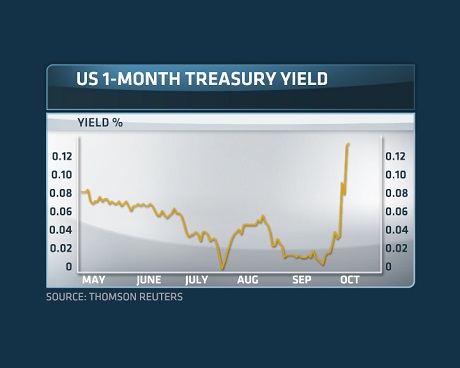
This short-term rate increase is only one of several signs that threaten to undermine this fragile stability, already supported only by heavy subsidies by the Fed from QE. This indicates fear in the short-term borrowing markets that even the hint of a default will cause too much demand for overnight funds than the supply at a given price will allow.
06242013 June 24, 2013
Posted by easterntiger in economic history, economy, financial, gold, markets, silver, stocks.Tags: bonds, Economic Cycles, economic theory, Federal Reserve, Financial Trends, gold, interest rates, momentum indicator, silver, stocks
add a comment
Weather Report 06212013
Current Positions (No Changes)
I(Intl) – exit; S(Small Cap) – exit; C(S&P) –exit
F(bonds) – up to 60%; G (money market) – remainder
Weekly Momentum Indicator (WMI) last 4 weeks, thru 06/21/13
+0.59, -7.61, -12.09, –20.02 (S&P100 compared to exactly 3 weeks before***)
(3 Friday’s ago/2 Friday’s ago/1 Friday ago/this past Friday)
My previous intention to follow-up the last report with just a gold/silver update, due to their importance, was interrupted by the fast moving events in stock and bond markets, plus, the additional unexpected events in gold and silver since the last report.
S&P500 had it’s worst week of the year.
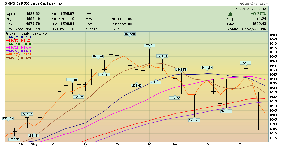
5 year treasury note interest rates had their fastest climb in 50 years. The rise in the 10-year note from 1.6% on May 2nd to 2.51% on Friday was a 52% rise. This is the largest rise on record for that time frame since records have been kept. But, since interest rates are tied closely to economic growth and inflation, either proof of economic strength, or, proof of inflation to a similar extent will be necessary to maintain rates at these levels. (May year-over-year inflation rate is at 1.36%, dramatically below the 3.91% average since the end of the Second World War and over a full percent lower than its 10-year moving average.) Neither are likely, meaning rates will re-adjust from this panic spike.
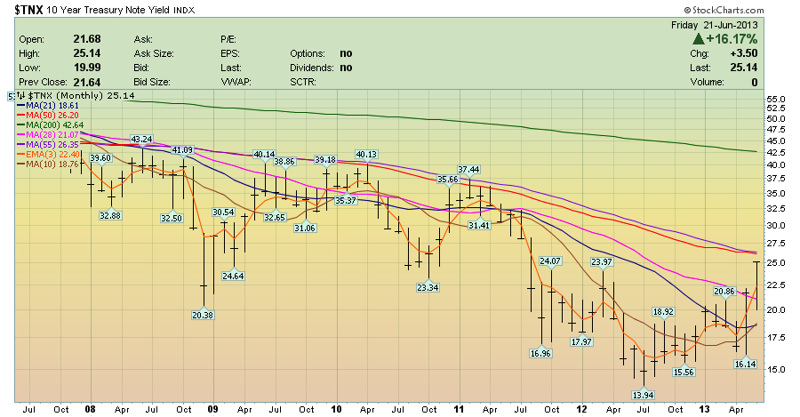
This time, rates on the 10-year note moved from 1.6 to the current 2.5. In 2010, they moved from 2.3 to 3.7 before stopping. In 2008/9, the moved from 2.0 to 4.0 before stopping. So, notice that the ‘high’ rate peaks have dropped from 4%, to 3.7%, and now to 2.5%. Until something else changes, the trend is still down, just as it’s been for over 32 years.
With rising rates and falling stocks, there is nowhere to go in the TSP, except to the G. This rarely happens except for short periods of time. Normally, rates fall when stocks fall, showing the shift from risk to safety, or, from safety back to risk. Bonds lose their safe status temporarily when the Fed is not emphatically indicating intentions to keep rates low. Their interpretations of economic strength are not well-founded, as proven by the rapid reaction to rising rates weakening housing demand, even at these low rate levels. China’s manufacturing purchasing manager’s index is in a contraction phase. Plus, a cash crunch is getting a hand’s off signal from their central bank. Neither of these are good for the rest of the world’s dreams for stability or growth. The rising rates on this chart go opposite from the F fund. This chart is updated more frequently than the F fund chart. I’m holding position, due to the enormous spread between rates and inflation, which will correct, without a large ‘drawdown’ occurring.
Two normally diverse markets breaking down at once could be a very bad sign, just as it was at the stock peak in 2007. Even routinely defensive stock sectors, such as utilities, telecom, materials , consumer staples and health care were some of the worst performers. One explanation could be that heavy selling in so many sectors is due to a response of over-leveraging; too many people with their resources spread too thinly. Near-record margin debt levels will ultimately lead to some panic selling.
The run down in the F fund over the past 5 weeks was deceptive, as it paused as if to stabilize 9 times since the top in mid-May. Rapid interest rate increases in short periods of time of the type that we’ve seen in the past 5 weeks are just part of the game. There have been 27 such occurrence just since 2007, and 4 other times in the past 18 months. These quick, news driven bursts are nearly always followed by an equal or longer period of falling back to an average. The 6/50 rule says that there is a 50 basis point change in interest rates at least every 6 months. (50 basis points are equal to ½ percent). For all of the chatter about the impact of higher rates, these rates are no higher than the lows of 4 years ago. In other words, for the past 24 months, we’ve been experiencing some of the lowest rates in over 60 years anyway. Bouncing off of 60+ year lows is really no cause for alarm. What is alarming is that even these movements have consumers nervous enough to halt home purchases, showing up in a noticeable reduction in mortgage applications.
Gold and silver appeared to settle for almost 6 weeks following their dramatic corrections in mid-April. I was looking for another buying opportunity. Sensing no surprises ahead of the latest Fed meeting last week, I purchased another incremental position. I was prompted by a ‘sale’ from my favorite purchase site, of 0.99 over the spot price of the day. I did experience another minor drop in the price of silver after my purchase.
Regardless, these large moves in both directions are classic commodity movements and are no cause for alarm. Traders do not simply ‘buy and hold’ as retail investors are predisposed to be, or, are led to believe is the right behavior. Traders ‘trade’ to get the most out of short-term movements, to pocket profits, then, to reposition for the next move.
Statistically, gold and silver are flashing ‘buy’ signals, being further below the mean than at any time since 2003. Here are some important notes.
* Silver is ‘oversold’, requiring a 147% advance to return to it’s 2011 high.
* Silver rose 428% from 2001 to 2008. It declined by 60% from that high.
* It then advanced 493% to it’s 2011 high. It has now declined by 61% from that high as of this past Friday’s prices.
* Of 41 bear markets since 1879 in gold & silver, this 2-year decline from the last significant high is #7 in time and #10 in the percentage decline.
* Of 26 silver bear markets since 1858, this one is #14 in terms of time and #6 in percentage decline.
* A cyclical low is due in the precious metals before September of this year.
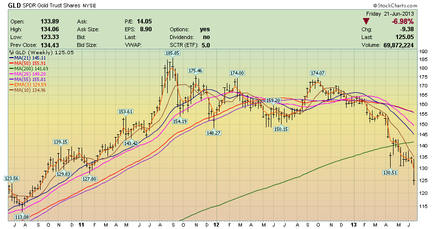
Heavy buying at this dip is occurring in both India and China, traditional heavy gold consumption areas. Historically, gold has regained at least 80 percent from each bottom within 3 years. And, even that would be an under-performance of expectations, since banks have now gone into very strong buying positions. Even if silver and gold drop further, I plan to buy silver at each additional $2/oz drop in anticipation of regaining profitable positions within 1-2 years.
All indications are that the highs in May, around May 22nd/23rd, are the highest stock prices we will see until a measurable, if not substantial correction is complete. The 23% advance to 1687.18 on the S&P500, from November 16th to May 22nd, at 4 months and 22 days is #44 out of 135 advances of this type since 1886, and #56 in terms of percentages since that time. Because the average advance is 26% in 6 months and 6 days, probabilities are very strong that no further upside can be expected. We can expect to fall about 10% from that high, and, where 56% of the corrections are completed in just under 2 months., 80% are complete within 3 months, and, 90% within 4 months. Similar corrections last year lost about 11% each time, and with each pullback being complete in just under 2 months.
04082013 April 8, 2013
Posted by easterntiger in economic history, economy, financial, gold, markets, oil, silver, stocks.Tags: bonds, economic theory, f fund, Federal Open Market Operations, gold, interest rates, silver
add a comment
Weather Report 04082013
Current Positions (No Changes)
I(Intl) – exit; S(Small Cap) – exit; C(S&P) –exit
F(bonds) – up to 60%; G(money market) – remainder
Weekly Momentum Indicator (WMI) last 4 weeks, thru 04/05/13
+17.08, +15.87, +5.25, -2.26 (S&P100 compared to exactly 3 weeks before***)
(3 Friday’s ago/2 Friday’s ago/1 Friday ago/this past Friday)
Although I normally try to issue my updates closer to the end of each month, I found that the positioning from the previous report was more than adequate for the trends in place as the end of March approached; thus, requiring no change and having no significant update in terms of other information.
With the topping/breakdown of the levels of the banking/financial sectors early in the week, this forced a quick 3% decline of the S Fund from the highs, and a near 4% decline of a close proxy, the Russell 2000. These erase between two to six weeks of gains off the previous levels on the I fund and proxies, including the iShares EAFE Index Fund. This epitomizes the time lost with little gain, and the phrase ‘all risk, no reward’.
In contrast, the positioning that I took in the F fund in late February has paid off handsomely, after a long back and forth pause through late February/early March. In a clear sign of real demand, heavy volumes of bond buying took place at every low price point over the past 6 weeks. Following several disappointing news stories this week in the employment sector, this bond buying accelerated rapidly this week, forcing bond prices back to their highest levels since December.
In my humble opinion, I believe that the acceptance of this developing employment weakness is the first crack in the Fed’s fantasy theory of using their latest tactics (QE3 and beyond) to ‘lower’ the unemployment rate. Until they can stop the fall in the labor force participation rate, and truly IMPROVE EMPLOYMENT and not just LOWER THE STATISTICAL RATE, any so-called ‘improvements’ will be only be superficial. Fed policy and the unemployment rates are much like you or I controlling the movements of the rabbit we see in our back yard – no tapping on the window is allowed.
Oh, wait…it’s not just me. Here is a quote from Dallas Federal Reserve President Richard Fisher a few months ago, in a rather weak moment of revelation.
“The truth, however, is that nobody on the committee, nor on our staffs at the Board of Governors and the 12 Banks, really knows what is holding back the economy. Nobody really knows what will work to get the economy back on course. And nobody – in fact, no central bank anywhere on the planet – has the experience of successfully navigating a return home from the place in which we now find ourselves. No central bank – not, at least, the Federal Reserve – has ever been on this cruise before.”
Those who see strength in stock prices are somehow unable to factor in the obvious strength in bond prices, which indicate a greater demand for safety than demand for risk. Gains in stocks will be mostly backed by vapor, and are subject to unexpected corrections for as long as interest rates continue to fall and bond prices continue their strength due to this heavy buying. A matter of increasing bond purchasing is something that an $80-85b/month in Fed stock price manipulation, through broker/dealers short-term purchasing, cannot overcome. The stock/bond ratio I track is back to near a February level, now at 0.377. I expect stocks to continue to weaken from this level and for this ratio to continue to fall. This will correspond to an increase of F fund shares until further notice.
The inability of stocks to further exceed or even hold the recent highs, including slight all-time highs on two indexes, the Dow Industrials and the S&P500, could signal what’s referred to as a ‘failed breakout’, and a lost opportunity for equity bulls. There are short-term sell signals in several key sectors, including energy, materials and technology. Other signs of potential trouble for stocks include the number of stocks declining versus the number of stocks advancing, European financials, falling bond yields, homebuilders, and food & beverage stocks. Additionally, these factors are combined with continued buying in other safety sectors, specifically utilities. These combinations do not transmit a good signal to continued stock stability.
In another sign of stock instability, a ‘buying climax’ was reached by a large number of S&P500 stocks. This occurs when a stock reaches a 52-week high, then reverses to close lower than the previous week. This occurred in 73 stocks this week. This is the highest number since May of 2011. In 17 buying climaxes since 1996, stocks have been down 10 times after 1 week, 11 times after 2 weeks, 10 times after 3 weeks, 10 times after one month. On the positive side, after one year, in each case, the S&P500 was higher.
The most recent technical picture similar to the current one saw the S&P500 lose about 100 points, or about 7%, over the next 6 to 8 weeks. I expect the F fund to continue to rise during that time. An exit to protect the gain should then be executed.
Although sell/exit zones are easier to detect than buy/entry zones in secular (long-term) bear markets, for at least the past three years, buy zones or lows have occurred between September and November, and sell zones or highs have occurred in March and April.
Gold has broken, by $6, the low of last May. This puts a question mark on whether gold will find support for a future advance, or, if this is the start of another longer period of near term weakness, taking the price back to recent 2010 levels.
Silver is in the midst of exceeding it’s longest correction in history, in terms of time, 6mo 3d, since the previous high in early October. The longest previous silver correction was 5m 21d, in 2007. Most silver corrections are from 2 to 4 months.
Unlike gold, silver has not fallen below lows of the past 2 years and remains less of a puzzle, at this particular time, than gold.
Over the past two years, silver has advanced each time it’s dipped between $26 and $28/ounce. It’s now at $27.22. Another view is to divide the price of gold by the price of silver. This determines when silver is in the bargain range by comparison. In the past 2 years, silver has been a buy when the ratio was above about 57 ounces of silver per ounce of gold. It has been as high in that time frame as 59 last July. I purchased silver at that time. It is currently at 57.9. I plan to purchase again as a hedge against future higher prices, at this point of higher potential reward than potential risk. A normal advance from this current position would be 42%.
Why do I prefer silver to gold?????
I have a number of reasons, starting with the ease with which silver can be acquired at near spot prices in various quantities, small or large, as opposed to greater markups which are more significant on gold, except at higher quantities.
Follow this video for the #1 reason why I prefer silver to gold.
http://www.bloomberg.com/video/the-day-the-government-took-our-gold-d_oPD_2KTayTnSpqco6kDw.html
Could it happen again? I’m not willing to take the risk that it will by focusing on gold only. I will gradually hedge a part of my silver holdings into gold.
01102013 January 10, 2013
Posted by easterntiger in economic history, economy, financial, gold, markets, silver, stocks.Tags: Economic Cycles, economy, Financial Trends, gold, momentum indicator, silver, stocks
add a comment
Weather Report 01102013
Current Positions (Changes)
I(Intl) – exit; S(Small Cap) – exit; C(S&P) –exit
F(bonds) – up to 50%; G(money market) – remainder
Weekly Momentum Indicator (WMI) last 4 weeks, thru 01/10/13
+3.93, -3.84, +26.75, +23.08 (S&P100 compared to exactly 3 weeks before***)
(3wks ago/2wks ago/1 wk ago/today)
This 3+ year rebound from the most recent market bottom of March 2009 to current levels is #8 in terms of time (3y6m8d) and #10 out of 29 in %age advance (121) out of 30 bull markets in history.
Similar Advances
1942-5 – up 158% (4y1m1d) — 1962-6 – up 80% (3y7m14d) — 1896-9– up 173% (3y0m28d)
In each case, a very dramatic decline occurred, all similar to levels near the 40-50% levels, close to the lows of 2011. This could unfold by the end of 2013.
One key measure that I follow is a gauge of buying strength between stocks (risk) and bonds (safety) has signaled market turn zones 4 times in the past 2 years, at 0.3549 (2/11), 0.3532 (5/11), 0.3516 (4/12) and 0.3568 (9/12). This measure is now at 0.3555 after hitting 0.3566 last Friday.
Before you become impressed with a 121% return in 3-4 years, recall that your timing would have had to have been perfect at the bottom (this never happens), you would have had to be all cash in order to make that purchase, and, unless you met those two conditions, you would have either incurred losses from the decline into that point, or, more likely, you would have found yourself joining that party quite some time after March 2009, when you felt comfortable with the market environment, which was surely looking quite negative in terms of outlook at that bottom. That March 2009 bottom was also a TWELVE-YEAR LOW!! So, technically, this 121% should be averaged over the 15-16 years from where it truly began, not just from 3 years. 7.5 to 8%% per year….near where the long-term averages suggest. But, hold on. We will correct this for one other factor later after we look at the performance of world markets for 2012.
Hint – all that glitters isn’t gold.
Recent touches this week at 5-year highs are portrayed as good news for market watchers. The news fails to acknowledge that these 5-year highs are coming at about one point per day over the past week, due to lower volatility, lower volume, no real buying, and simple complacency to the risks. This is the ideal environment for what is called ‘distribution’. Distribution is the process where ‘strong hands’ are distributing (selling, unloading) stocks at high prices to ‘weak hands’, usually retail and individual investors in a very slow, deliberate and methodical manner. This also means that with the exception of retracing the moves down, all we done is go nowhere in 5 years. Similarly, year-end reports of a low double digit gain overall in 2012 in some indexes don’t account for the fact that these double digit gains are back to single-digit gains, when averaged for the previous two years, which were slightly negative (2011) and slightly positive (2010). Single-digit gains over three years when accounting for the current significant risk of equity positions puts those gains into a reasonable perspective. Further, markets that continue to bounce off old highs without going through, and without regular pullbacks for low-risk buying opportunities, are often referred to as ‘overbought’ and represent high-risk buying zones. Buying in overbought conditions invites a higher probability of loss than for gain.
Here is a broader picture of 2012 performance among a wider number of asset classes.

PLEASE CLICK THE TABLE TO ENLARGE
Here is a table of local currency, US$, British pound, EURO and gold measured market 2012 returns.
| Local | USD | GBP | EUR | Gold | ||
| 1 | FTSE/Thailand | 35.7% | 40.8% | 36.4% | 37.1% | 32.0% |
| 2 | DAX | 29.1% | 31.2% | 27.2% | 27.8% | 23.1% |
| 3 | Hong-Kong | 22.9% | 23.2% | 19.4% | 20.0% | 15.6% |
| 4 | Bombay SE | 25.7% | 21.1% | 17.4% | 18.0% | 13.6% |
| 5 | Korea Exchange | 9.3% | 18.7% | 15.0% | 15.6% | 11.3% |
| 6 | Stockholm | 12.0% | 18.7% | 15.0% | 15.6% | 11.3% |
| 7 | Swiss MI | 14.9% | 18.0% | 14.4% | 15.0% | 10.7% |
| 8 | All Ordinaries | 13.5% | 16.8% | 13.2% | 13.7% | 9.5% |
| 9 | Euronext100 | 14.8% | 16.7% | 13.2% | 13.7% | 9.5% |
| 10 | Nasdaq | 15.9% | 15.9% | 12.3% | 12.9% | 8.7% |
| 11 | Russia TSI | 10.5% | 15.6% | 12.1% | 12.6% | 8.4% |
| 12 | S&P500 | 13.4% | 13.4% | 9.9% | 10.5% | 6.4% |
| 13 | FTSE 100 | 5.8% | 11.8% | 8.3% | 8.9% | 4.8% |
| 14 | Nikkei 225 | 22.9% | 10.1% | 6.7% | 7.2% | 3.3% |
| 15 | Toronto SE | 4.0% | 6.9% | 3.6% | 4.1% | 0.3% |
| 16 | Shanghai | 3.2% | 4.5% | 1.3% | 1.8% | -2.0% |
| 17 | Shenzen | 1.7% | 3.0% | -0.2% | 0.3% | -3.4% |
| 18 | FTSE/JSE | 4.8% | 0.9% | -2.2% | -1.7% | -5.3% |
| 19 | Bovespa | 7.4% | -2.1% | -5.1% | -4.7% | -8.2% |
| 20 | Madrid | -7.2% | -5.7% | -8.6% | -8.2% | -11.6% |
When corrected for the decline of our currency value of the US dollar in terms of the growth in value of gold, we’ve actually had, on the S&P500, only a 6.4% gain for the year, rather than 13.4%. The US dollar declined in value by 6.5% in 2012. Recall that you must also view this in terms of the past 3 years (two flat years before) and the risks of exposure to downside threats.
Based upon recent weeks performances, this rebound is clearly showing signs of what can be termed, without exaggeration, exhaustion.
Total changes over the past week, the net change since the day of the announcement of the fiscal cliff deal are as follows:
| Current | 1/2/13 High | Total Change | Daily Change | |
| COMPQ |
3121.76 |
3118.18 |
3.58 |
0.716 |
| Dow Indus |
13471.51 |
13412.71 |
58.8 |
11.76 |
| S&P500 |
1472.12 |
1462.43 |
9.69 |
1.938 |
| S&P100 |
667.59 |
663.87 |
3.72 |
0.744 |
| Wilshire |
15520.17 |
15380.61 |
139.56 |
27.912 |
| $RUT |
883.19 |
873.99 |
9.2 |
1.84 |
| EFA |
57.92 |
57.78 |
0.14 |
0.028 |
One additional measure of market activity is the volatility index, or the VIX. The VIX is a gauge on the movements of major investors, as they hedge their portfolios against risk. Following the removal of the fiscal cliff uncertainty, hedges, or bets against high risk, were unwound at an extremely high rate, declining the VIX by 37% in five days. While this might point to a feeling of reduced risk on one hand, it is also a significant rise in complacency on the other hand.
As per The Wall Street Journal’s MarketBeat column, the 37% hit was the biggest five-day drop since 1990. And, according to the same column, it doesn’t bode well going forward:
In the nine previous instances in which the VIX fell by 30% or more over a five-day span, stocks have lagged their customary returns, Bespoke Investment Group says.
The S&P 500 has averaged a 1.5% decline over the next week, Bespoke also says. The index also averages a drop in the ensuing month and three-month time horizons.
Further, using this gauge, over the next six months, the S&P 500 has averaged a 3% gain, below a 3.9% average return for all six-month periods since 1990.
“The results are not attractive,” says Paul Hickey, co-founder at Bespoke.
For one corresponding downside target, if the NASDAQ breaks 2435 (June 4th low and July 26, 2011 high), it is likely to show a continuation of excessive weakness.
Bill Gross is the manager of Pimco’s Total Return Instl (MUTF:PTTRX), and was named Morningstar’s Fixed Income Fund Manager of the Decade in 2010. Earlier this week, Gross discussed his economic outlook for 2013. Originally the result of two tweets via the Pimco Twitter account, the fund manager mentioned that “stocks in 2013 depend on two primary things […] one: real economic growth, which we see at 2% or less, and second of all, the Fed […] Ben Bernanke isn’t Rumpelstiltskin,” adding that “he can only spin straw into gold for so long.”
Gold ($1655.70) and silver ($29.97) are undergoing minor corrections, well within the normal ranges in terms of time and price, from their highs on Oct 5th (gold) and Oct 1st (silver). In terms all corrections measured back to the beginning of futures trading for gold, as of Jan. 5th, 84% of all corrections of this type have been complete within this time frame, likely leading to another rise in price. In another 30 days, 95% of all corrections were complete in gold. While in silver, 82% of all corrections were complete within 90 days (Jan. 1st) and 85% were complete within another 30 days.
Bill Gross also chimed in on his perspective on gold by simply Tweeting, ’gold goes up…’.
Obviously, Gross’s general bullishness on gold is a result of the Fed’s continuous monetary easing, but it’s worth noting that he doesn’t have a specific target. On the subject, he had this to say:
“We think gold will move higher, as well commodities; it’s hard to say exactly how much. Gold, to my way of thinking, is a function of real interest rates. To the extent that real interest rates have continued low […] ultimately it’s an asset that depends on inflation, to the extent that the Fed and other central banks can re-flate the economy […] a 10-20% return from gold […] is a thing of the past as well.”
Even more interestingly, Gross admitted that, in his opinion, “all asset markets are in this period […] in which less than double-digit returns are going to be the order of the day.”
On the contrary to Gross projection, in dollar terms, gold is on a 12 year win streak that is difficult to match as an asset class.
We’ll see if Gross is right as the future unfolds, or, if gold will continue to be the standout investment for the next decade.
Caution – as shown earlier, these ‘double-digit returns’ are also influenced by dollar erosion!!
11192012 November 20, 2012
Posted by easterntiger in economy, financial, gold, markets, oil, silver, stocks.Tags: bonds, Economic Cycles, Federal Reserve, Financial Trends, gold, interest rates, Markets, momentum indicator, oil, silver, stocks, wilshire 5000 index
add a comment
Weather Report 11192012
Current Positions (Changes)
I(Intl) – up to 5%*; S(Small Cap) – up to 5%*; C(S&P) –up to 5%* ; F(bonds) – up to 20%; G(money market) – remainder
Weekly Momentum Indicator (WMI***) last 4 weeks, thru 11/19
-9.38, -26.36, -27.34, -15.02
(3wks ago/2wks ago/1 wk ago/today)
****search the blog for a detailed description of this personal indicator
Markets alternate between periods of fear and hope. Hope for an agreement to avoid the automatic mechanisms of the fiscal cliff at the end of the year have taken to the stage, while fear of failure and, to some extent, the European debt crisis have moved slightly away from focus.
As a part of recent fears, Apple had fallen $175/share, or 25% from its’ record high at $705. As it represents a larger portion of both the NASDAQ and the S&P100 than any other individual stock, Apple and the NASDAQ led the indexes up earlier this year, and both led all indexes down over two months. It’s not likely that a solid reversal will occur here without Apple and the NASDAQ. Another cue to a reversal would be the emergence of a bond interest rate low/bond price high, with volume significant enough to drive money from the safety of bonds to the an attractive risk in equities. With some momentum, a light holiday week rally is almost a guarantee.
Before today’s advance, the S&P500 (SPX) had fallen 8.1% since the high on October 8th. It had reversed 62% of it’s gain into that October 8th high as measured from the last low on June 4th. This 62% reversal from a peak is often seen by market technicians as a key point to gather strength for a reversal back up, not necessarily AT this level, but, from NEAR these levels. This level is seen as major support for the Russell 2000 small caps. Further, light volume tends to favor upward reversals during holiday weeks, at least barring any additional fundamentally bad news from the remainder of the financial markets, internationally or domestically. I would recommend higher allocations of equities if I did not believe that a slightly ‘lower low’ might be in the cards before the next higher and more significant advance takes place. If there is another low within the next two weeks or so, I will suggest another 5% increment in equities toward an expected year-end, QE3 induced/supported, fiscal cliff optimism rally. Based upon the S&P500, S&P100 and Wilshire 5000 composite all returning back above their key 200-day moving averages today (after spending 3 days below), this is a positive signal for the short-term, favoring upside. Potential upside movement is approximately 4 times the potential downside movement, over the short to intermediate term.
In my previous full post, the recommendation to hold a half allocation* of equities based upon the prospect of an advance was hinged upon the fact that the Dow Industrials had not experienced a 1% decline the entire quarter. Historically, this bode extremely well for the prospects for a higher advance. However, on October 10th, I suggested an exit from equities based upon two days in which the Dow Industrials exceeded this 1% decline. There have been 4 other days since the October 10th exit recommendation where this decline has also exceeded 1%. Prior to today, there had been only 2 positive days exceeding 1% since October 10th.
In spite of any upward reversals between now and the end of the year, we could see a 35-50% or more drop in the S&P within the next 12-24 months, simply on the basis of long-term projections, which would refer to recent levels as likely 4-year highs.
Charlie Minter and Marty Weiner of Comstock Partners have the following to say in a brief last week….” the factors that have sparked the stock market in the last few years have come to an end. In our view, this is readily apparent in the change in trend since the peak on September 14th. We think that date will turn out to be the top for some time to come.” However, shorter term, Doug Kass, founder and President of Seabreeze Partners Management, Inc suggests, “…the elements of a fiscal cliff compromise are in place and that the market is exaggerating the chance of failure. …Stocks should follow to the upside.” These are not necessarily conflicting views, as the Comstock view takes the next few years into account, while the Seabreeze view focuses more on the shorter term. From these two views, there appears to be some upside at this point. However, it does appear to be limited.
Some casual observers attributed the sharp (2.4%) post-election sell-off in US equities to President Obama’s re-election. However, within hours after the election results, the major causes were developing elsewhere; and they remind investors of pre-existing concerns that, unfortunately, won’t go away quickly.
One key observer was on a trade floor when US equities started heading south on that morning following the election. It was a little after 7 A.M. on the east coast. The trigger was a speech by Mario Draghi, the President of the European Central Bank. The result was an immediate sharp fall in European shares and in US futures.
Draghi echoed a theme highlighted elsewhere: the slowing of the German economy, Europe’s largest. Together with TV scenes of violence on the streets of Athens, this reminded investors that Europe’s crisis is far from over.
Draghi’s remarks were amplified by investors’ legitimate concerns on how or whether the new Congress and President Obama would both work faithfully to resolve the fiscal cliff – a self-inflicted problem that, if poorly handled, would push the US into recession. And this relates to a deeper and important question; and one that we need to monitor carefully in the months ahead. There is some serious soul searching ahead for our two political parties.
The issues that challenge both political parties will be in play as politicians struggle to deal with the fiscal cliff. They will be even more visible as politicians seeks to do in this term what eluded them earlier –mobilize sufficient congressional support to maintain policies that sustain high growth, create meaningful jobs, and improve medium-term financial sustainability. Positive rumors on Friday on the progress of negotiations on the fiscal cliff resulted in a strong reversal off earlier lows of the day.
In addition to the fiscal cliff headlines, but, never far away from the bigger picture, Greek parliamentarians recently took the final major step needed to unlock a fresh injection of cash into their imploding economy. Now the focus shifts to external creditors. Expect them to also come through in the next few days. Yet none of this high drama meaningfully changes the awful outlook facing the country’s struggling citizens.
There remain at least three huge problems – with the approach being pursued by Greece and its European neighbors. And they are interconnected in a manner that aggravates the country’s outlook.
First, the design of the program is still flawed. If fully implemented, it does very little to counter the forces of economic contraction; and it does not meaningfully improve medium-term fiscal solvency. And this is even before you focus on the underlying operational assumptions which are, once again, way too optimistic.
Second, external creditors are providing too little support – not only via new cash but, as important, in terms of debt reduction. The former is needed to deal with mounting domestic payments arrears and upcoming obligations. The latter is required to overcome the “debt overhang” that undermines the inflow of capital that is so critical to private sector activity, investment and employment; and this needs to include debt reduction on official loans.
Third, the again-revised program will not crowd into productive investments. Companies clearly see the problems. Much more importantly, Greek citizens are losing the little trust they still have—which isn’t much – in their institutions of government and in the solidarity of their European neighbors.
At best, this latest iteration of yet another Greek bailout will buy a little more time. It will do nothing to meaningfully improve the prospects for the country and its besieged citizens. For that, Greece and Europe need a meaningful reset of their operational and institutional approaches.
Light crude oil is back at $89/barrel, near a level that has held declines going all the way back to late 2009. There is little or no expectation of further declines below this support level in the absence of significant unfavorable economic news around the world. Similarly, unleaded gasoline is also in a range where price support has existed all this year. Therefore, no further decline in gasoline prices should be expected under normal conditions.
Interest in gold is just off of a two-month low.
Interest in silver is at a nineteen-month high as traders moved in to ‘buy the dip’ near $32.50.


