10152013 October 15, 2013
Posted by easterntiger in economic history, economy, financial, gold, markets, silver, stocks.Tags: bonds, Economic Cycles, Economic History, f fund, Federal Open Market Operations, Federal Reserve, Financial Trends, gold, interest rates, momentum indicator, stock market index, stocks, wilshire 5000 index
add a comment
Weather Report 10152013
Current Positions (Changes)
I(Intl) – exit; S(Small Cap) – exit; C(S&P) –exit
F(bonds) – up to 70%; G (money market) – remainder
Weekly Momentum Indicator (WMI) last 4 weeks, thru 10/15/13
+10.74, –4.37, -4.78, +6.25 (S&P100 compared to exactly 3 weeks before***)
(3 Friday’s ago/2 Friday’s ago/Friday – 1 week/today)
Patterns are what I constantly observe. Beneficial patterns are what I seek to use for my advantage. Hazardous patterns are what I seek to avoid. Indecisive patterns are treated as hazardous patterns.
Recent patterns have tended toward uncertainty. Here is some proof.
Friday, once again, headlines read this weeks ‘market rally’ as great news, in anticipation of a ‘deal’ on the ‘hill’. Last month, it ‘rallied’ on the peaceful solution to a Syrian crisis, followed by ‘rallying’ again on the continuation of QE/failure to taper from the Fed.
So many ‘rallies’!!! What is the net result of all of these ‘rallies’ over time?
I deliberately paused from updates due to the succession of intervening news events, both positive and negative. Very little has changed. As proof, here were the following measures of key indexes one month after the last report in June and the net change as of Friday.
Index July 29th Oct 9th Friday Changes
1 2 3 1to2 1to3
Dow Industrials 15521.97 14802.98 15237.11 -4.63% -1.84%
S&P100 756.60 737.29 757.73 -2.55% +0.15%
S&P500 1691.65 1656.40 1703.20 -2.08% +0.68%
Russell 2000 1040.66 1043.46 1084.31 +0.27% +4.19%
Wilshire 5000 18187.97 17688.15 17871.47 -2.75% -1.74%
10-year treasury note 2.585% 2.65% 2.682% +2.51% +3.75%
The S&P100 is just 9 points higher than it was 5 months ago, at the time of a new ‘all-time high’.
The risk remains higher than the potential reward, in spite of $2-4 billion per day in Fed feeding.
It took above average increases in the past 3 days just to bring several key indexes beyond their levels of July 29th; virtually nowhere in the past 11 weeks. Even further, the S&P100 was near 547 during an earlier high in mid-May, only 11 points below today’s high. We are now sitting around 9 points below the highs of the year.
This lack of progress is intentional. This pattern has every appearance of the year-long ‘tops’ that occurred in 2000 and 2007 before the start of major corrections that resulted in 40% losses in a manner of less than a year.
When you examine the 2000 and 2007 tops (and most market peaks outside of the “V-top” ones like 1987) you’ll notice the churn both before and after what turned out in hindsight to be the final peak. The S&P 500 experienced a correction of more than 10% in Jul-Oct 1999 that was then fully recovered, another 10% correction in Jan-Feb 2000 that was then fully recovered, another 10% correction in March-May 2000 that was fully recovered, and a final high in September after which the S&P 500 was cut in half. Likewise in 2007, a 10% correction in Jul-Aug was fully recovered by the October 9, 2007 peak, and the first 10% correction off the peak was followed by a 7% recovery into December before the market began to decline in earnest. Even then, once the market had lost 20% in March 2008, it mounted a nearly 12% advance by May 2008, as a further loss of more than 50% lay ahead.


It was this sort of rolling top, with intermittent corrections being followed by recoveries to yet further marginal highs, that prompted this quote from Barron’s magazine just before the 1969-1970 bear market plunge:
“The failure of the general market to decline during the past year despite its obvious vulnerability, as well as the emergence of new investment characteristics, has caused investors to believe that the U.S. has entered a new investment era to which the old guidelines no longer apply. Many have now come to believe that market risk is no longer a realistic consideration, while the risk of being underinvested or in cash and missing opportunities exceeds any other.”
Investors lose a full-cycle perspective during these periods of enthusiasm. But remember the regularity, worse in the 2008-2009 bear, but consistent throughout history, for typical bear markets to wipe out more than half of the gains from the previous bull market advance (and closer to 85% of the prior gains during “secular” bear phases). Somehow this outcome will be just as great a surprise to investors when the present cycle completes as it has repeatedly been in market cycles throughout history.
Gold
Someone, somewhere is trying to keep the price of gold low. On Tuesday, October 1st at 2:00 AM EST, it was reported that someone put in an order to sell 800,000 ounces, or about $1 billion worth of gold. The price plunged from $1332/oz to $1293/oz. Then, on Wednesday, October 9th at 8:40 AM EST, an equally large “market sell” order of 600,000 ounces of gold – valued at $786 million was made. Then, finally on Thursday, October 10th, again at 8:40 AM EST, with ZERO news other than the poor JPM and WFC earnings, and less progress in the government shutdown/debt ceiling talks than expected – a whopping TWO MILLION OUNCE “market sell” order hit the COMEX, valued at a ridiculous $2.6 BILLION. This suspicious sequence could only have been deliberate deception to create the false impression that other assets are more preferred than gold, in the same way as stock prices have been supported for the past 4 years by the Federal Reserve to make stocks appear to be a preferred asset, in spite of stock prices returning less than 4% of that over the past 14 years of gold/silver returns. Why would someone want to steer you away from the least promoted, but, best asset class of the past decade, precious metals, while also attempt to encourage you to stay invested in one of the most publicized, but, weakest class, stocks? After all, gold and silver are real, but, stocks are paper.
Interest Rates
My over-weighting of the F fund is to anticipate the ‘flight to safety’ that normally occurs during periods of stock weakness and surrounding periods of financial stress. The threat of either a credit downgrade, a debt ceiling fight, or default all play into the hands of a desire for a reduction in risk, and a desire for protection that higher bond prices offer. The false expectation of a summer stock swoon was the purpose for weighting in F earlier in the year. The Fed’s May pre-announcement of expected tapering in September offset that expectation and drove bond prices and the F fun to a slightly lower bottom. That bottom has firmed over the past 4 months, along with the corresponding ceiling on interest rates. In spite of the hysteria and anxiety of higher rate expectations, rates today are no higher than they were almost 4 months ago.
Near panic continued to rule the interest rate picture since that premature, ‘pre-taper’ announcement from the Fed in May. Rates on the 10-year Treasury note ultimately rose from a low of 1.6% on April 16th, completing practically 90% of it’s final rise within 9 weeks. Nevertheless, the media flooded the air with scare stories about rapidly rising interest rates, when not viewing the context that the highs of this year were lower the lows of 4 & 5 years ago. Rates actually rose only a average of 0.00106 points per day between June 24th and September 25th. Between August 19th and September 16th, this rate rose less than 3% of the rate from the April low to the ultimate high of 2.984% on September 6th. Overall, rates continue to rise and fall within a declining channel, just as they have for the past 30 years. Much of the concern in the past few months on rate increases appeared to be psychological.
The de-emphasis of tapering, reducing the $85 billion purchase of mortgages backed securities by the Fed,has extended the impression of downward Fed pressure on rates. This reversed much of the losses incurred in the F fund during the mini-rate ‘panic’ of May/June.
However, within the past week, world reaction has responded to the stalemate in Washington, by moving from short term treasuries, such as this 1-month note, and into longer term notes, given the increases in risk associated with the now increasing probability of a debt payment being missed, if there is no prompt action on the debt ceiling. News stories or politicians who suggest a lower level of concern on the debt ceiling, citing the $250 billion dollars in collections versus $20 billion dollars in payment due, fail to account for the rest of the balances planned against the collections, spread through thousands of obligations worldwide.
Simply ‘prioritizing’ these obligations within the current limit would immediately create an actual elevated risk, removing the universally accepted ‘risk-free’ aspect of US government debt, and immediately raise interest rates. The impact would ripple instantly through any interest rate sensitive activities, such as housing, construction, real estate, lending, leveraged instruments, etc., and further into retail, travel, and on. The fragile state of economic stability would rattle any buffer that currently exists between the current state and an actual recession, as measured by lower levels of economic output and/or growth. Already, the costs of insuring U. S. government bonds has risen to levels not seen in five years. This insurance is a premium paid against the probability of default. We might not believe that a default will occur, but, this doesn’t stop others around the world from preparing for the unlikely event anyway.
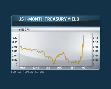
This short-term rate increase is only one of several signs that threaten to undermine this fragile stability, already supported only by heavy subsidies by the Fed from QE. This indicates fear in the short-term borrowing markets that even the hint of a default will cause too much demand for overnight funds than the supply at a given price will allow.
05252013 May 25, 2013
Posted by easterntiger in economic history, economy, financial, markets, stocks.Tags: bonds, Economic Cycles, Economic History, Federal Open Market Operations, interest rates, stock market index, stocks
add a comment
Weather Report 05252013
Current Positions (No Changes)
I(Intl) – exit; S(Small Cap) – exit; C(S&P) –exit
F(bonds) – up to 60%; G (money market) – remainder
Weekly Momentum Indicator (WMI) last 4 weeks, thru 05/24/13
+10.24, +32.01, +35.32, +15.51 (S&P100 compared to exactly 3 weeks before***)
(3 Friday’s ago/2 Friday’s ago/1 Friday ago/this past Friday)
F fund positions lost much of the profits that had accumulated since March, but, they are still above the levels where entry was made in February.
Seasonally, equity market corrections that do not begin by May often postpone until after Independence Day. Price support due to end of month, end of quarter ‘window dressing’ for May and June is very appealing to fund managers. Minor allocations to S, C and I funds are slightly less risky now than in April, although, as with the year so far, gains are likely to be infrequent, news-driven, listless, jerky, i.e., one day gain, followed by several days of little or no gain/small losses.
Naturally, it is your discretion, depending on your tolerance for risk. HOWEVER – normally, the longer the delay in a correction, the more SEVERE that correction when it finally arrives!! Be very alert for quick exits.
With the sudden blaze of activity in the past 4-6 weeks, it’s a really good time to ask the question ‘…where are we now….?
I use a lot of images in my own conclusions. I rely on the images of others to help me correlate to my conclusions. So, I decided to include a few here for impact.
Price Action
First, the bullish meter is pushing extremes (Investor’s Intelligence registers 55% bulls, a 2 year high and considered ‘over-bullish’; 49% from the American Association of Individual Investors), as is always the case at ‘tops’…. Corporate insiders have used almost 7 of the past 12 months as selling opportunities. Commercial traders and institutions are holding their largest ‘net short’ positions in over 5 years, indicating an expectation for lower prices sooner than later.
 (it’s always brightest at the top)
http://www.hussmanfunds.com/wmc/wmc130422.htm
“Dow 16000!” – Barron’s Magazine Big Money Poll 4/20/2013
And, in case no one remembers…..
“Dow 14000?” – Barron’s Magazine Big Money Poll, May 2, 2007
“Still Bullish! (Dow 13000)” – Barron’s Magazine Big Money Poll, May 1, 2000
Someone also believed that this wouldn’t stop the last two times that it did.
How does this 4-year rally compare with the past?

This chart shows at the ‘You are here’ point that the rise since the 12-year bottom in March 2009 is well below average both duration and magnitude when compared to all rallies from previous 30% declines. The rallies of 1903, 1933 and the average of all 1900-2010 rallies are above the current trend. We’re only performing slightly above the 2002 rally. You’d never know this from the repetition of the ‘all-time highs’ mantra being promoted by the media, trying to convince you that the good times are back again, even at this over-extended peak, just 100 S&P points above our levels of almost 6 years ago.
In order to justify claims of how great a market you’re missing, the media can’t decide whether it’s better to use last November as a bottom, prior to the now-forgotten fiscal cliff time bomb, or, the March ’09 bottom of 1000 days ago, the peak of the financial crisis period. Either way, it’s ok, after the fact, of course, to ignore the many other barriers that were ahead of us at either time, i.e., the many unknowns that have now become ‘knowns’. Hindsight is always so 20-20. We should just trust them, expose our funds to risk and pat ourselves on the back when (if) it all works out. Some of these former barriers have yet to be solved, yet, conveniently, they can be ignored for now.
Current hindsight suggests that a pre-Thanksgiving allocation would have been the right thing to do.
But, only with the benefit that hindsight offers, I have assembled a table of just what events it took to move the markets in the past 28 weeks. In the absence of well-timed doses of ‘jaw-boning’ by the central banks or high ranking officials, the movement of about 15 days out of the past 130 would not have made a dent at all, exposing much more risk than reward.
Note how the average daily movement was under 1 point per day, in the absence of some ‘encouragement’ from the sidelines, in the form of promises , crisis aversion, or direct stimulation. So, where was the buying, strong fundamentals or true participation by motivated investors? It’s still mostly absent.
Week 1 = Nov 19-23
| S&P100 | |||||||||
| Avg Changes | |||||||||
| Over | Points | ||||||||
| 1 Week | Per Day | ||||||||
|
1 |
24.02 |
Japan Weakens Yen, Feeding Loans to Other Stock Markets | |||||||
|
2 |
3.34 |
0.668 |
|||||||
|
3 |
-0.57 |
-0.114 |
|||||||
|
4 |
-2.07 |
-0.414 |
|||||||
|
5 |
5.21 |
1.042 |
|||||||
|
6 |
-8.34 |
-1.668 |
|||||||
|
7 |
24.07 |
Last-minute fiscal cliff resolution | |||||||
|
8 |
3.19 |
0.638 |
|||||||
|
9 |
3.49 |
0.698 |
|||||||
|
10 |
5.78 |
1.156 |
|||||||
|
12 |
4.15 |
0.83 |
|||||||
|
13 |
1.74 |
0.348 |
|||||||
|
14 |
0.93 |
0.186 |
|||||||
|
15 |
-0.35 |
-0.07 |
|||||||
|
16 |
0.03 |
0.006 |
|||||||
|
17 |
14.62 |
Outgoing Chinese leader pledged record stimulus spending | |||||||
|
18 |
2.43 |
0.486 |
|||||||
|
19 |
-0.13 |
-0.026 |
|||||||
|
20 |
4 |
0.8 |
|||||||
|
21 |
-5.08 |
-1.016 |
|||||||
|
22 |
15.89 |
Federal Open Market Committee notes show no bad news | |||||||
|
23 |
-14.56 |
Weaker Chinese growth signaled in weak GDP | |||||||
|
24 |
11.58 |
Contractions in European data signals possible Eurozone QE | |||||||
|
25 |
13.25 |
Positive(?) Jobs Report | |||||||
|
26 |
7.2 |
1.44 |
|||||||
|
27 |
14.33 |
2.866 |
|||||||
|
28 |
-6.81 |
-1.70 |
Fed ‘Tapering’ hint | <thru <5/24 | |||||
Viewed differently, what kind of ‘signal’ was being given after each market day from the first of the year, and, during the most recent slightly more positive period?
Last 100 days Last 60 days
from Jan 1st from March 1st
42.00% 45.00% Positive or Long Signals
22.00% 21.67% Neutral Signals
36.00% 33.33% Negative or Short Signals
Less than 50% of the indications could be considered safe or low risk during these periods. If you’ve benefited from positions this year in equities, consider yourself among the risk-embracing fortunate ones. A reminder – gains are slow; losses are rapid – stay alert.
US markets have performed only average compared to markets worldwide. 
Best returns came mostly from markets with major economic or competitive disadvantages or loose monetary policies, flirting with future inflation or other future imbalances. How much risk are we willing to take to maintain our ‘wealth effect’?
Smithers & Company, a London market-research firm, says that, according to a number of market indicators, US stocks are, by historical standards, forty to fifty per cent overvalued at our current levels.
The most recent surges in world market levels have also been influenced by Japan’s decision (see week 1 in the table) to create a competitive advantage through currency expansion….a flood of cheap money, i.e., Japanese money printing has helped weaken the yen and boost Japanese stocks. This advantage has risks and has so far not provided substantial benefit. (Japanese exports are still below expectations). However, more recently, this has also put extreme upward pressure on interest rates in Japan, which they can ill afford. It has also served as a source of newly borrowed money by world traders to speculate (short-term) in US and European markets. That’s the good news. The bad news is these are loans and they must be repaid.
There is no free lunch.
In an interview with Talking Numbers Bill Fleckenstein of Fleckenstein Capital said he thinks Japanese easy money and “Abenomics” in general is “dangerous” for the domestic economy and global markets.
“What is going on in Japan is potentially very, very dangerous not just for Japan but for world markets. And, I’m not speaking about the Nikkei. What has taken place in the Japanese JGB [Japanese government bond] is extraordinary. In the last three days, the yield has gone from 60 basis points to 86. Can you imagine what would happen in America if yields on 10-year Treasuries went from 6% to 8.6%?
“There are huge derivative books in Japan where there’s been tremendous amount of derivatives written assuming that rates would stay low forever. I think this could be on the verge of blowing up. This may be the start of it, this may get quiet, or it may get ugly right now. That will impact the American bond market and it will affect equities everywhere. So, it’s potentially dangerous.”
The impact of some rising rates in the US has already had an undesirable impact.
The last 2 weeks have seen mortgage applications plunge at their fastest rate for this time of year (a typically busy time) since the financial crisis began.
Back in the US, the hype of the ‘positive’ US jobs reports, with a headline number of +165,000 on the establishment survey, and 293,000 on the household survey, failed to officially acknowledge some the less attractive details – 441,000 voluntary and involuntary part-time jobs by those who would rather have full-time work, and an actual LOSS of over 148,000 full-time jobs. The labor force participation rate was flat at 63.3%, dating back to a 1979 low.
Inconsistency in properly interpreting jobs data by the media is creating a gap between hype and reality.
Analogy – If I replace my 10 year-old car, because of fear of long road trips, with a 13-year old car, I still have a net loss of zero on car ownership (-1 job, +1 job = zero net loss), but, will my automobile ‘output’ improve, or will it decline? If more jobs lost are replaced by equivalent or better jobs, then, positive jobs numbers are good news. If lost jobs are replaced with jobs of lower quality, or, average lower income, then, even ‘positive’ jobs numbers are not truly positive.
Fact – net income has been falling for over seven years.
Stimulus
Where are we?
It’s much more than price action that matters; if the price action is so encouraging, why do we still need stimulus? Because price action is what shows up in the front window to keep customers coming in. Here’s what’s going in the corner offices upstairs.
The hint of further stimulus 4 weeks ago (week 24 in the table above) began a surge of European markets, primarily the French CAC (+8.6%), the London FTSE (+6.6%) and the German DAX (+11.6%) year-to-date, near their highs for the year.
So, you see, the market participants want it both ways…..
Strong economic data? = Rally! Because it’s good news.
Weak economic data = Rally! Because, it’s bad news and the Fed/ECB will step in.
It’s like expecting your grass to be green year-round.
“…U.S. stocks rose, sending benchmark indexes to records, after Federal Reserve Bank of St. Louis President James Bullard said the central bank should continue its bond buying to boost growth….”
Economic activity continues to wind and slow decline off of the post-recession burst. QE (quantitative easing) is losing it’s effectiveness.
 U.S. Economic Activity and QE, 2000-present, chart courtesy John Hussman
It was this discussion on whether or not to continue stimulus at the current levels, and the mention of a keyword ‘tapering’ that caused this weeks’ roll back over to reality, and away from last weeks’ ‘we’re in the money’…..until we’re not.
Notes from the Federal Open Market Committee
“a few participants expressed concern that conditions in certain U.S. financial markets were becoming too buoyant…. One participant cautioned that the emergence of financial imbalances could prove difficult for regulators to identify and address, and that it would be appropriate to adjust monetary policy to help guard against risks to financial stability.”
Be careful for what you wish.
Profits
Where are we?
It’s certainly unusual for corporate profits to soar during a slow recovery.
The four most dangerous words in investing may be “This time, it’s different.”
Take taxes: one big reason that after-tax corporate profits are much higher than their historical norm is that corporations pay much less in taxes than they used to. In 1951, corporations had to pay almost half of reported profits in taxes. In 1965, they had to pay more than thirty per cent. Today, they pay only around twenty per cent.
Then, there’s globalization. Many of the “American” companies in the S. & P. 500 are multinationals: a study of two hundred and sixty-two of them found that, on average, they got forty-six per cent of their earnings from abroad. This is a relatively new phenomenon. As late as 1990, foreign earnings accounted for only a small fraction of corporate profits in the U.S. Today, they account for almost a third of corporate earnings, and they’ve nearly tripled since 2000. So comparing corporate profits only to American G.D.P. yields a false picture of how companies are doing. The global economy, even with its current woes, is projected to grow more briskly than the U.S. economy over the next decade, so corporations will continue to benefit.
Technicals
Where are we?
The blue lines on the chart below identify each point in history where the following (1) overvalued, (2) overbought, (3) over-bullish, (4) rising bond yields syndrome would have been observed: (1) overvalued S&P 500 with the Shiller P/E (the ratio of the S&P 500 to the 10-year average of inflation-adjusted earnings) greater than 18; (2) overbought within 3% of its upper Bollinger band (a) standard deviations above the 20-period average at daily, weekly, and monthly resolutions, (b) more than 7% above its 52-week smoothing, and (c) more than 50% above its 4-year low; (3) over-bullish with the 2-week average of advisory bullishness (Investors Intelligence) greater than 52% and bearishness below 28%; and (4) bond yields rising with the 10-year Treasury bond yield higher than 6-months earlier. August 1929 can also be included, given that we can impute bullish/bearish sentiment with reasonable accuracy based on the size and volatility of prior market movements.
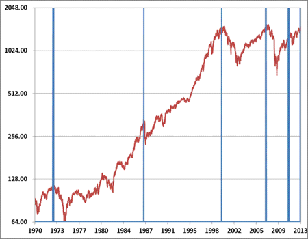
The amount of borrowed money in the market now exceeds that amount at the last peak in 2007. Margin calls to over-leveraged investors in a quick market turn are primary causes of unexpectedly rapid downward price movements. A bit of unplanned events are all that it takes to get the ball rolling. Negative net worth of NYSE accounts has reached the highest level since late 2000. To get the net worth figure, we subtract margin debt from the free credits to get an aggregate estimate of the net debit or credit sitting in margin accounts at brokerage firms. In other words, existing margin debt exceeds cash in these accounts by the largest margin in 13 years. (see red areas below).

Normally, I touch upon gold, silver or oil when it is appropriate. With the length of this current post, I will avoid any further discussions at the moment. Suffice it to say that the changes in gold and silver have been near epic since mid-April and warrant lengthy discussion on their own. If you have immediate questions, contact me directly, I I otherwise, look for some coverage on my next post. One word – caution.
01302013 Interim January 30, 2013
Posted by easterntiger in economic history, economy, financial, markets, stocks.Tags: bonds, Economic Cycles, economic theory, interest rates, momentum indicator, stock market index, stocks
1 comment so far
There is one trading day left on the January calendar. This is an opportune time to look at trends, and positions in place.
And, to update an observation from the early January post:
One key measure that I follow is a gauge of buying strength between stocks (risk) and bonds (safety) has signaled market turn zones 4 times in the past 2 years, at 0.3549 (2/11), 0.3532 (5/11), 0.3516 (4/12) and 0.3568 (9/12). This measure is now at 0.3555 after hitting 0.3566 last Friday.
This measure now stands at 36.88. This is almost an imperceptible level from 3 weeks ago. This denotes decreasing reward and increasing risks in
holding equities (S, I and C funds) and decreased risk in the F fund and related L funds.
Significantly, one market leader, the Dow Transportation index is exhibiting ‘terminal’ type behavior. It appears to be completing a parabolic rise into
yesterday’s high. This has advanced 21% in only 11 weeks. Strong transports theoretically ‘lead’ the Dow Industrials. It has reversed downward today, falling
today by the largest amount in over 3 months. Similarly, the proxy for the S fund, also reversing, is now net zero for the last 7 days, as of today.
The Dow Transport reached a record high on Monday. Three earlier record highs during the previous 14 years have signaled final market tops and significant
reversals in the next year following each, in 1999, 2007 & 2008.
The S&P100, which I use for the Weekly Momentum Indicator(WMI) has risen by an average of only 3.47 points per week for the past three weeks, or, a total of
10.41 points. Last week, the average per week was at 4.15 points per week, or a total of 12.46 points in the previous 3 weeks. This is clearly a game of giving you as much risk as is absolutely possible along with the least reward possible. If you enjoy running across a busy street to grab an extra $100-200 from the street, then, this is the market for you.
Ironically, the NASDAQ has risen just 1/10th of 1% YTD!! This ‘divergent’ manner among the major indexes is not an indication warranting high confidence.
I am doubling my allocation of F, with the least risk in over 5 years, which is right in line with the 5-year highs in several of the stock indexes.
11302012 – Interim November 30, 2012
Posted by easterntiger in markets, stocks.Tags: economy, momentum indicator, stock market index, stocks
add a comment
Interim Weather Report 11302012
Current Positions (Changes)
I(Intl) – exit; S(Small Cap) – exit; C(S&P) –exit
F(bonds) – up to 30%
G(money market) – remainder
Weekly Momentum Indicator (WMI***) last 4 weeks, thru 11/30
-26.36, -27.34, -4.44, +14.93
(3wks ago/2wks ago/ 1 wk ago/today)
Positions taken since the previous full report are up about 2% in just under 9 days, with minimal risk.
These positions took full advantage of the optimism over the latest extension of Greek debt support and initial White House/Congressional negotiations on the US fiscal cliff, bringing about a ‘risk-on’ scenario.
The German DAX index has just closed at a level that matches three previous highs since September. Each close at this level resulted in pullbacks ranging from 2.5% to 10% within weeks.
The standard proxy for the I fund has returned to the same upper bound for 3 months in a row, this current level. The previous two times, a 3% to 9% pullback followed within 2-3 weeks. This should again be expected between now and the end of December, practically regardless of other events.
The standard proxy for the S fund could only manage a lower level this month as compared to earlier highs in September, April, March and February. The current level is lower than all of those prior highs and appears to be running out of steam. The standard proxy for the C fund is performing similarly to the S fund proxy. Both are under-performing the I fund proxy. I use a trending indicator that, after showing strength in mid-month on a weekly basis, now shows another ‘topping’ pattern. This is in spite of these earlier appearances of strengthening, even through this current week. This strength could be an illusion, as in a classic example of ‘…past performance is no guarantee of future results…’.
With regrets for the increasing frequency of the need to monitor and adjust positions, the patterns in the past two years have, to use my earlier analogy, acted in the manner of a helium balloon, bouncing on the ceiling. This provides us with no opportunity to buy at truly low levels, without such extreme risk as in the 2011 European debt crisis. Instead, our opportunity is more like riding an entry from a modest pullback before riding the balloon back to the ceiling again. We bought at lower than average ‘weekly’ levels, and now we’re selling at higher than average ‘weekly’ levels. Opportunities to buy and sell near lower than normal annual or monthly levels are not available to us at present.
This ‘ceiling’ is very near the highs of this past March, and practically matches a level below the highs of 2007, and equal to the highs from 2008, and which, so far, are levels that are still much higher than the entire years of 2009, 2010 and 2011. We are trapped near the upper levels of a five-year high sandwich(!).
Until we have more than a modest pullback, an intermediate or major retrace to much lower levels, our only opportunity is to take advantage of these short-term moves. Otherwise, we can take advantage of… nothing.
Also, it does not seem that the Fed’s QE3 intervention is having the expected impact, at least, so far. If this response begins to show other evidence in the near term, and without the holding on to the risk in current positions, a new month ahead will offer us with a new allocation of moves that we can use to reenter a favorable position in one or more equity categories.
05042012 – Alert May 4, 2012
Posted by easterntiger in economy, financial, markets, oil.Tags: bonds, economy, Federal Reserve, Financial Trends, gold, momentum indicator, oil, stock market index, stocks
add a comment
Current Positions (No Changes)
I(Intl) – exit
S(Small Cap) – exit
C(S&P) – exit
F(bonds) – up to 60%
G(money market) – remainder
=======================================================
Weekly Momentum Indicator (WMI***see 110111 for reference)
Last 4 weeks, thru 5/4
-12.96, -14.58, +2.25, -0.81
(3 wks ago/2 wks ago/1 wk ago/this week)
In the past month,
* there are back-to-back, weaker than expected non-farm payrolls (jobs) reports for the US,
* UK has entered a double dip recession, joining Spain, Italy and the Netherlands, who’ve all had lower than expected services sector strength reports. The services sector is already the lowest paying sector of the economy, so, this does not bode well for the broader economies of each.
* Spain received a two-notch downgrade in it’s credit rating by Standard & Poor’s,
* Australia lowered their key interest rate, reflecting slowing conditions,
* interest rates have pushed to multi-month lows, once again, reflecting upon the low confidence in the long term economic stability, and keeping the F fund near recent high levels,
* oil has blasted back to levels not seen since December under the prospect of less hiring and it’s implications.
From a structural standpoint on the stock sector, this week’s weakness shows that there is no way to suppress this same underlying weakness, even underneath the masks of a new 4-year high in the Dow Industrials index this week, or from promises of more artificial support from Federal Reserve, as in, hints of central planning and temporary support to very narrow areas of the economy (finance, banking, etc.).
More signs of this weakness can only be delayed for so long before they show up in the daily measurements.
From a risk/reward perspective, the past two months have become all risk and absolutely no reward. But, oh, you say ‘so, why haven’t I lost any money?’
Here’s why.
Here are some recent closing prices on the S&P100, S&P500 (our C fund) and Russell 2000(small caps, our S fund)
3/13, 633; 1396; 831
3/14, 633; 1394; 823
3/22, 634; 1393; 821
3/23, 635; 1397; 830
4/4, 636; 1399; 820
4/5, 635; 1398; 818
4/12, 631; 1387; 808
4/17, 632; 1390; 810
4/25, 633; 1391; 812
4/27, 637; 1403; 825
4/30, 635; 1398; 816
5/1, 639; 1405; 815
5/2, 637; 1402; 818
Are you getting this yet?
If the current 2-month ‘trading range’ near the highs of the year do not hold, a substantial correction back toward November or October lows could be in the cards.
The F fund is still the safe and profitable place to be, as has been the case for much of the year.
04152012 May 4, 2012
Posted by easterntiger in economy, financial, markets, oil, stocks.Tags: bonds, Economic Cycles, economy, Federal Open Market Operations, interest rates, momentum indicator, oil, stock market index, stocks, wilshire 5000 index
add a comment
Current Positions (Changes)
I(Intl) – exit
S(Small Cap) – exit
C(S&P) – exit
F(bonds) – up to 60%
G(money market) – remainder
=======================================================
Weekly Momentum Indicator (WMI***see 110111 for reference)
Last 4 weeks, thru 4/13
+13.95, +19.45, +2.0, -12.96
(3 wks ago/2 wks ago/1 wks ago/last week)
On 2/27, I wrote that the markets were due to weaken within weeks. From March 2nd to March 7th, it took the deepest negative reversal of the year back to early February levels. This was followed shortly thereafter by another upward reversal, mostly on two separate ‘news’ events, including, (1) the latest Greek scare being averted ($100 billion dollar loan guarantee), and, (2) the Fed chairman hinting that a new round of quantitative easing might be on the table (QE3?), under certain conditions. At this point of narrowly focused optimism, the moderate level allocated to the F fund was forced to absorb a mild and manageable, negative turn. This was to be corrected with reality within days.
I also mentioned the DJ Total Stock Market index (DWC), which was once the Wilshire 5000 index. The target at that time was around 14,500. Although it continued to rise beyond that target, closing twice above 14,900, it is now just under that earlier projected target and closed at 14398 on Friday.
To emphasize this same point, the Russell 2000 small caps, like our S fund, has spent almost ½ of the past 13 months in the 800 to 850 range, including the past 10 weeks and all but 3 weeks of the period from February to August of 2011. The only time out of this range came with the descent below these levels, into last years crash, and up from the bottom reversal in early October leading back into the range in early February, and back down under 800 today
That early March downturn has turned out to be essentially a dry-run for the current weakness that began from the April 2nd peak. Current levels are between 3 & 4% lower from that peak, by index. The wake-up call this time around are the return of European concerns, specifically, rising Italian and Spanish bond rates, which raise the prospect of bank instability, as well as a decidedly different hint from the Fed chairman, that quantitative easing might NOT be counted upon to support the markets. This second peak created a one-month ‘double top’ pattern, reversing downward to even lower, late January levels. Overall, the internal market mechanisms have now weakened back to levels not seen since the debt and European issues of late November and are unlikely to recover back to recent levels for a minimum of 4-6 weeks, if not much longer.
Helping to accelerate the negativity on Spain last week was news that Spanish banks borrowed 316 billion euros from the European Central Bank (ECB) in March. That was 50% more than in February. The current worry is not that Spain is about to default on sovereign debt but that Spain’s banks are in serious trouble and the banking system could be in for some negative surprises. Spanish banks have been seeing large outflows of cash as the economic situation worsened. The run on the banks is similar to the one on Greek banks over the last two years. The end result for Spain is going to be the same. They are too big to fail and too big to save but the European Union (EU), European Central Bank (ECB) and International Monetary Fund (IMF) are sure to try and it will cause market problems worse than we saw with Greece.
The current U. S. markets are very much skewed in the direction of a small number of stocks, while the broader markets are mostly mired in ranges that go back to last years peak levels, making no progress. Lots of attention has been paid to Apple and it’s impact on the market, for good reason. With the weighting of individual stocks in the Nasdaq, Apple alone represents 15% of the entire value of the NASDAQ 100. So, just two companies, Apple and Google make up over 20% of the entire index of 100 companies.
This upcoming week, the focus will be on the next round of economic reports, and, most significantly, the level of interest on Thursday in the next Spanish bond auction. A lack of appetite for new Spanish debt is likely to have negative impact on European markets that would then ripple into our markets on Friday. Otherwise, more earnings reports that might appear encouraging, as they are normally presented, but, not fully masking other details.
Projections for 1st quarter earnings are running as low as 0.5%, according to Standard & Poors/Capital IQ. And that’s after a mediocre 4th quarter 2011, indicating the end of big earnings improvements that followed the depths of the 2008 financial crisis.
Investors are skeptic and have been all year. Just over half the total money invested in new funds has had two destinations: the iShares Barclays U.S. Treasury Bond Fund (symbol GOVT, with $297 million in flows) and Pimco’s Total Return ETF (symbol TRXT, with $267 million in flows). The standout new equity funds of 2012 in terms of flows are all iShares products – Global Gold Miners (symbol: RING), India Index (symbol: INDA) and World Index (symbol: URTH). Bottom line: even with the continuous innovations of the exchange traded fund (ETF) space, investors are still targeting international and fixed income exposure, a continuation of last year’s risk-averse trends and while ‘ETFs destabilize markets’ might be the prevailing group-think, this quarter’s money flows into newly launched exchange traded products reveals a strong ‘Risk Off’ investment bias.
I’ll go back one last time to the F fund. The largest drop in 4 months on the ‘good’ news in early March has been followed by the largest rise in 5 months, after the latest dousing by the Fed chairman, dismissing QE3. Clearly, from this move, and from the trend of purchases made by investors in the 1st quarter, the safety of the bond prices/falling interest rates still offer the safe bets once the weakness in equity prices accelerates in the coming weeks.


